Category: In Process

  • Dada

    Dada (/ˈdɑːdɑː/) or Dadaism was an art movement of the European avant-garde in the early 20th century. The beginnings of Dada correspond to the outbreak of World War I. For many participants, the movement was a protest against the bourgeois nationalist and colonialist interests, which many Dadaists believed were the root cause of the war, and against the cultural and intellectual conformity—in art and more broadly in society—that corresponded to the war. Dada, in addition to being anti-war, had political affinities with the radical left and was also anti-bourgeois.

    The movement primarily involved visual arts, literature, poetry, art manifestos, art theory, theatre, and graphic design, and concentrated its anti-war politics through a rejection of the prevailing standards in art through anti-art cultural works.

    Dada Google images

    Edited from Wikipedia article

    To quote Dona Budd’s The Language of Art Knowledge,

    Dada was born out of negative reaction to the horrors of the First World War. This international movement was begun by a group of artists and poets associated with the Cabaret Voltaire in Zurich. Dada rejected reason and logic, prizing nonsense, irrationality and intuition. The origin of the name Dada is unclear; some believe that it is a nonsensical word. Others maintain that it originates from the Romanian artists Tristan Tzara’s and Marcel Janco’s frequent use of the words “da, da,” meaning “yes, yes” in the Romanian language. Another theory says that the name “Dada” came during a meeting of the group when a paper knife stuck into a French-German dictionary happened to point to ‘dada’, a French word for ‘hobbyhorse’.

    Origins and influences

    The roots of Dada lay in pre-war avant-garde. Cubism and the development of collage, combined with Wassily Kandinsky’s theoretical writings and abstraction, detached the movement from the constraints of reality and convention. At least two works qualified as pre-Dadaist, a posteriori, had already sensitized the public and artists alike: Ubu Roi (1896) by Alfred Jarry, and the balletParade (1916–17) by Erik Satie. The influence of French poets and the writings of German Expressionists liberated Dada from the tight correlation between words and meaning, The term anti-art, a precursor to Dada, was coined by Marcel Duchamp around 1913 when he created his first readymades (everyday objects found or purchased and declared art) such as a bottle rack).

    Dada in Zurich, Switzerland, began in 1916, spreading to Berlin shortly thereafter, but the height of New York Dada was the year before, in 1915. Key figures in the movement included Hugo Ball, Emmy Hennings, Hans Arp, Raoul Hausmann, Hannah Höch,Johannes Baader, Tristan Tzara, Francis Picabia, Richard Huelsenbeck, George Grosz, John Heartfield, Marcel Duchamp, Beatrice Wood, Kurt Schwitters,Hans Richter, and Max Ernst, among others.

    The movement influenced later styles like the avant-garde and downtown music movements, and groups including surrealism, Nouveau Réalisme, pop art and Fluxus.

    Political underpinnings

    Many Dadaists believed that the ‘reason’ and ‘logic’ of bourgeoisie capitalist society had led people into war. They expressed their rejection of that ideology in artistic expression that appeared to reject logic and embrace chaos and irrationality. For example,George Grosz later recalled that his Dadaist art was intended as a protest “against this world of mutual destruction.”

    According to Hans Richter Dada was not art: it was “anti-art.” Dada represented the opposite of everything which art stood for. Where art was concerned with traditional aesthetics, Dada ignored aesthetics. If art was to appeal to sensibilities, Dada was intended to offend.

    As Hugo Ball expressed it, “For us, art is not an end in itself … but it is an opportunity for the true perception and criticism of the times we live in.”

    Art techniques developed

    Dada activities included public gatherings, demonstrations, and publication of art/literary journals; passionate coverage of art, politics, and culture were topics often discussed in a variety of media.

    Collage

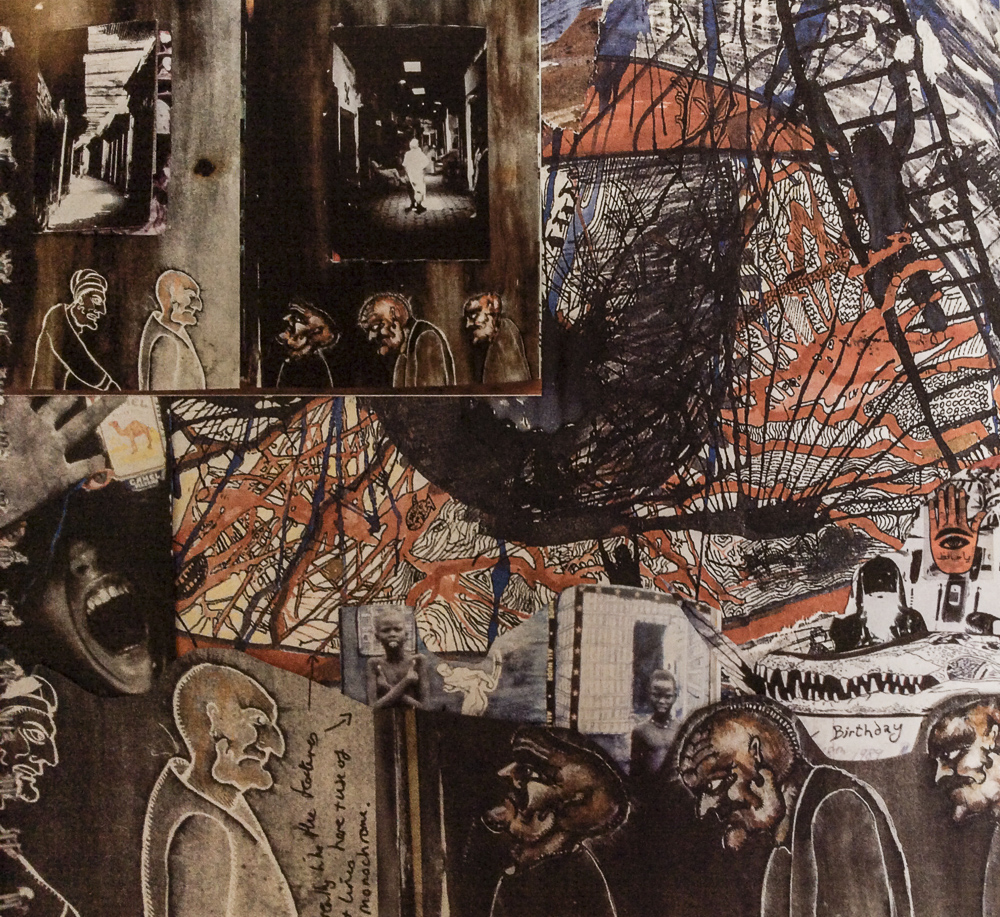
    The Dadaists imitated the techniques developed during the cubist movement through the pasting of cut pieces of paper items, but extended their art to encompass items such as transportation tickets, maps, plastic wrappers, etc. to portray aspects of life, rather than representing objects viewed as still life.

    Photomontage

    The Dadaists – the “monteurs” (mechanics) – used scissors and glue rather than paintbrushes and paints to express their views of modern life through images presented by the media. A variation on the collage technique, photomontage utilized actual or reproductions of real photographs printed in the press. In Cologne, Max Ernst used images from the First World War to illustrate messages of the destruction of war.

    Assemblage

    The assemblages were three-dimensional variations of the collage – the assembly of everyday objects to produce meaningful or meaningless (relative to the war) pieces of work including war objects and trash. Objects were nailed, screwed or fastened together in different fashions. Assemblages could be seen in the round or could be hung on a wall.[31]

    Readymades

    Marcel Duchamp began to view the manufactured objects of his collection as objects of art, which he called “readymades”. He would add signatures and titles to some, converting them into artwork that he called “readymade aided” or “rectified readymades”. Duchamp wrote: “One important characteristic was the short sentence which I occasionally inscribed on the ‘readymade.’ That sentence, instead of describing the object like a title, was meant to carry the mind of the spectator towards other regions more verbal. Sometimes I would add a graphic detail of presentation which in order to satisfy my craving for alliterations, would be called ‘readymade aided.’” One such example of Duchamp’s readymade works is the urinal that was turned onto its back, signed “R. Mutt”, titled “Fountain”, and submitted to the Society of Independent Artists exhibition that year. The piece was not displayed during the show, a fact that unmasked the inherently biased system that was the art establishment, seeing as any artist that paid the entry fee could in theory display their art, but the work of R. Mutt was banished by the judgment of a group of artists.

    Poetry; music and sound

    Dada was not confined to the visual and literary arts; its influence reached into sound and music. Kurt Schwitters developed what he called sound poems, while Francis Picabia and Georges Ribemont-Dessaignes composed Dada music performed at the Festival Dada in Paris on 26 May 1920. Other composers such as Erwin Schulhoff, Hans Heusser and Albert Savinio all wroteDada music, while members of Les Six collaborated with members of the Dada movement and had their works performed at Dada gatherings. Erik Satie also dabbled with Dadaist ideas during his career, although he is primarily associated with musical Impressionism.

    In the very first Dada publication, Hugo Ball describes a “balalaika orchestra playing delightful folk-songs.” African music and jazz was common at Dada gatherings, signaling a return to nature and naive primitivism.

    Artists

  • Modernism

    Modernism in design and architecture emerged in the aftermath of the First World War and the Russian Revolution – a period when the artistic avant-garde dreamed of a new world free of conflict, greed and social inequality. It was not a style but a loose collection of ideas. Many different styles can be characterised as Modernist, but they shared certain underlying principles:

    • a rejection of history and applied ornament;
    • a preference for abstraction;
    • a belief that design and technology could transform society.

    Key movements

    Also:

    Key graphic designers

    Also:

    • Herbert Bayer
    • Laszlo Moholgy-Nagy
    • Theo van Doesburg
  • Art&Language

    Art&Language

    Art & Language is a pioneering English conceptual art group founded in 1968, that questioned the critical assumptions of mainstream modern art practice and criticism. The group was founded in Coventry, England by Michael Baldwin, David Bainbridge, Terry Atkinson and Harold Hurrell. The critic and art historian Charles Harrison and the artist Mel Ramsden both became associated with the group, in 1970.

    Their conceptual art privileges the relationship between a work of art and its environment, and a work of art and the observer. Examples are mirrors that have no content and only reflect the environment and/or invite the observer to interact.

    Some works address the issue of art that has no physical object, and resorts to text to describe it.

    Secret Painting 1967-68 is a black square painted within a black square and thus has nothing in it. But with accompanying block of text next to it in a dyptych frame the same size as the painting stating ‘the content of this painting is invisible. The character and dimension of the content are to be kept permanently secret, known only to the artist. ‘ a sort of joke, using text to indicate that the painting is still a work of art.

    https://media.artgallery.nsw.gov.au/collection_images/3/30.2003.a-b%23%23S.jpg

    In terms of my own work I am not really sure of the relevance – I find the whole discussion somewhat obscure, self-indulgent and pedantic.

    The main points that have some interest for me are that:

    • it is possible to produce a image that is completely opaque as a means of attracting the viewer’s attention to a piece of text.
    • it is possible to produce an image whose main function is to reflect back to the viewer and leave the interpretation completely to them.
  • John Baldessari

    “What motivates me is the elusive quality if trying to get things right....art is the only thing that gets me close to understanding what the universe is all about.”

    John Anthony Baldessari (born June 17, 1931) is an American conceptual artist known for his work featuring found photography and appropriated images. Initially a painter, Baldessari began to incorporate texts and photography into his canvases in the mid-1960s. In 1970 he began working in printmaking, film, video, installation, sculpture and photography.

    http://www.baldessari.org

    He often plays with different ways of combining text and image. In his Prima Face series he produced large square diptychs of image and text. In the first ones he just put simple captions that described the colours of the image. The next he put captions that made assumptions about the meaning of peoples’ expressions. The third he put opposing interpretations of expressions for the viewer to choose. The next he put a list of synonyms and so on…

    Some of his best known work is where he puts flat coloured cutout shapes on photographs eg people climbing up buildings. The bits he cuts out are those elements that people are most interested in, thus focusing on things we do not normally notice. One body of work are photographs of civic officials at events where he covers their faces with round coloured shopping stickers to focus on their postures instead of faces.

    He lives and works in Santa Monica and Venice, California.

    Most of his work plays with combinations and collisions between the narrative potential of images and the associative power of language. Found images are often collaged and worked into/over with stickers or flat coloured paper shapes. Much of the work is concerned with the nature of art in a playful manner. Other work is humorously enigmatic, turning things upside-down to make the viewer aware of how they think and show that there are different ways of understanding things.

    He takes things from everywhere, and can’t throw anything away. It can all be used in art. He uses images from movies a lot. He prints a lot of images out, lays them on a big table and groups them. Some of his work is in grids eg on violence. Some is collage.

    Collage takes things from here and there and puts them together. “Collage is when two things don’t go together too easily. If it’s right there’s a kind of tautness there that if you pull them apart any further it’ll snap. If you get them any closer it’ll be just flabby. But if you can get it just right it’s terrific.”

    He is interested in signifiers eg clouds are ephemeral, they change shape and we see things in them.

    The important thing is to hold the audience’s attention eg image of table and shark. Things must be dissimilar enough to be intriguing.

    Some of his recent work uses vibrant colour and takes a more low relief 3D approach to collage.

    A short but detailed overview on Baldessari’s art done by Baldessari himself with Tom Waites.
    Baldessari explains his approach to appropriation – no one can own images any more than they can own words. Images are there to be used.
    In depth discussion of different aspects of his work.
  • Bob & Roberta Smith

    Bob and Roberta Smith is the pseudonym of the artist Patrick Brill. Born in London, he studied at the University of Reading from (1981-1985) and Goldsmiths College (1991).

    He trained as a sign painter in New York and uses text as an art form, creating colourful slogans on banners and placards that challenge elitism and advocate the importance of creativity in politics and education.

    His best known works are Make Art Not War (1997) and Letter to Michael Gove (2011), a letter to the UK Secretary of State for Education reprimanding him for the “destruction of Britain’s ability to draw, design and sing”.

  • Saul Bass

    Saul Bass (1920 – 1996) was an American graphic designer and Academy Award winning filmmaker, best known for his design of motion picture title sequences, film posters, and corporate logos. Much of Saul Bass’s work was made in close collaboration with his wife Elaine.

    During his 40-year career Bass worked for some of Hollywood’s most prominent filmmakers, including Alfred Hitchcock, Otto Preminger, Billy Wilder, Stanley Kubrick and Martin Scorsese. For Alfred Hitchcock, Bass provided effective, memorable title sequences, inventing a new type of kinetic typography, for North by Northwest (1959), Vertigo (1958), working with John Whitney, and Psycho (1960). Among his most famous title sequences are the animated paper cut-out of a heroin addict’s arm for Preminger’s The Man with the Golden Arm, the credits racing up and down what eventually becomes a high-angle shot of a skyscraper in Hitchcock’s North by Northwest, and the disjointed text that races together and apart in Psycho.

    Bass aimed to get the audience to see familiar parts of their world in an unfamiliar way. Examples of this or what he described as “making the ordinary extraordinary” can be seen in Walk on the Wild Side (1962) where an ordinary cat becomes a mysterious prowling predator, and in Nine Hours to Rama (1963) where the interior workings of a clock become an expansive new landscape.

    Bass also designed some of the most iconic corporate logos in North America, including the Bell System logo in 1969, as well as AT&T’s globe logo in 1983 after the breakup of the Bell System. He also designed Continental Airlines’ 1968 jet stream logo and United Airlines’ 1974 tulip logo, which became some of the most recognized airline industry logos of the era.

    Some of the most remarkable opening titles designed by Saul Bass, sometimes in collaboration with his wife Elaine Bass. From “The Man with the Golden Arm” (1955) to “Casino” (1995), this video represents a substantial part of his creative legacy in chronological order.

    I want to make beautiful things, even if nobody cares, as opposed to ugly things. That’s my intent.

    ‘’try to reach for a simple, visual phrase that tells you what the picture is all about and evokes the essence of the story”

    “making the ordinary extraordinary”

    “The nature of process, to one degree or another, involves failure. You have at it. It doesn’t work. You keep pushing. It gets better. But it’s not good. It gets worse. You got at it again. Then you desperately stab at it, believing “this isn’t going to work.” And it does!” by Saul Bass

    Source: Wikipedia article

    Anatomy of a Murder
  • Rick Poynor

    2007 Obey the Giant: Life in the Image World. First Things Next

  • Ian Hamilton Finlay

    Ian Hamilton FinlayCBE (28 October 1925 – 27 March 2006) was a Scottish poet, writer, artist and gardener. Born in Nassau, Bahamas his family moved back to Scotland. At the age of 13, with the outbreak of the Second World War, he was evacuated to family in the countryside. He was educated at Dollar Academy, in Clackmannanshire and later Glasgow School of Art. In 1942, he joined the British Army. He died in 2006 in Edinburgh.

    http://www.ianhamiltonfinlay.com

    https://www.victoria-miro.com/

    Wikipedia

    Finlay’s work has been seen as austere, but also at times witty, or even darkly whimsical.

    Poetry

    At the end of the war, Finlay worked as a shepherd, before beginning to write short stories and poems, while living on Rousay, in Orkney. He published his first book, The Sea Bed and Other Stories, in 1958, with some of his plays broadcast on the BBC, and some stories featured in The Glasgow Herald.

    His first collection of poetry, The Dancers Inherit the Party, was published in 1960 by Migrant Press with a second edition published in 1962.

    In 1963, Finlay published Rapel, his first collection of concrete poetry (poetry in which the layout and typography of the words contributes to its overall effect), and it was as a concrete poet that he first gained wide renown. Much of this work was issued through his own Wild Hawthorn Press, in his magazine Poor. Old. Tired. Horse.

    Finlay became notable as a poet, when reducing the monostich form to one word with his concrete poems in the 1960s. Repetition, imitation and tradition lay at the heart of Hamilton’s poetry, and exploring ‘ the juxtaposition of apparently opposite ideas’.

    Art

    Later, Finlay began to compose poems to be inscribed into stone, incorporating these sculptures into the natural environment. This kind of ‘poem-object’ features in the garden Little Sparta that he and Sue Finlay created together in the Pentland Hills near Edinburgh. The five-acre garden also includes more conventional sculptures and two garden temples.

    Hamilton Finlay and George Oliver’s 1973 Arcadia screenprint uses camouflage in modern art to contrast leafy peace and military hardware. He continually revisited war themes and the concept of the Utopian Arcadia in his work.