forthcoming


Linda Mayoux Notes for Creative Activism
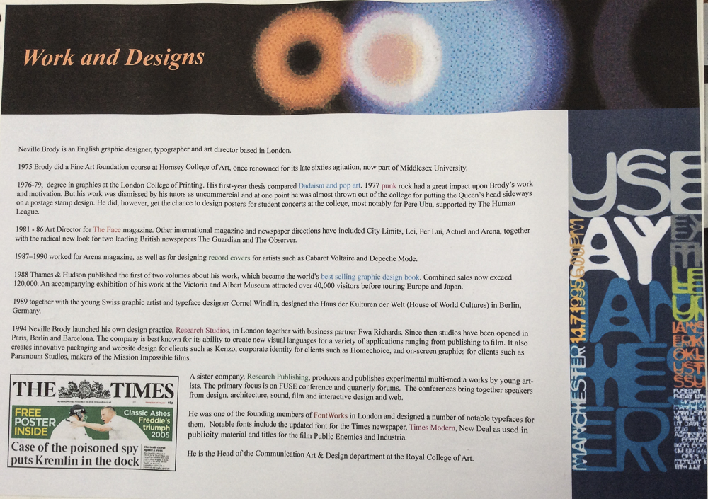

Neville Brody (born 23 April 1957 in London) is an English graphic designer, typographer and art director. Influenced by Punk, Dada and Pop Art. He is the Head of the Communication Art & Design department at the Royal College of Art.
In 1988 Thames & Hudson published the first of two volumes about his work, which became the world’s best selling graphic design book. Combined sales now exceed 120,000. An accompanying exhibition of his work at the Victoria and Albert Museum attracted over 40,000 visitors before touring Europe and Japan.
He was a founding member of Fontworks in London and designed a number of notable typefaces for them:
1990 he also founded the FontFont typeface library together with Erik Spiekermann.
As I stood admiring just before sunrise, the reed-tops bending under their beautiful crystal heads, rooks came flying from a wood near by, and a vast flock of peewits darkened the sky. As the yellow sun arose in frosty splendour mists began to rise on the river, and there followed a brief spell of magic beauty ere the thickening mists began to bury everything as they blew in fitful gusts from the river. in On English Lagoons (1893)
Do not put off doing a coveted picture until another year, for next year the scene will look very different. You will never be able twice to get exactly the same thing. 1889


Confessions from Emerson’s book ‘Pictures From Life in Field And Fen’, 1887
Peter Henry Emerson (13 May 1856 – 12 May 1936) was a British writer and photographer. Emerson was intelligent, well-educated and wealthy with a facility for clearly articulating his many strongly held opinions. His photographs are early examples of promoting photography as an art form. He is known for taking photographs that displayed natural settings and for his disputes with the photographic establishment about the purpose and meaning of photography.
Emerson was born on La Palma Estate, a sugar plantation near Encrucijada, Cuba[1] belonging to his American father, Henry Ezekiel Emerson and British mother, Jane, née Harris Billing. He was a distant relative of Samuel Morseand Ralph Waldo Emerson. He spent his early years in Cuba on his father’s estate.
During the American Civil War he spent some time at Wilmington, Delaware, but moved to England in 1869, after the death of his father.
He was schooled at Cranleigh School where he was a noted scholar and athlete. He subsequently attended King’s College London, before switching to Clare College, Cambridge in 1879 where he earned his medical degree in 1885.
In 1881 he married Miss Edith Amy Ainsworth and wrote his first book while on his honeymoon.The couple eventually had five children.
He bought his first camera in 1881 or 1882 to be used as a tool on bird-watching trips with his friend, the ornithologist A. T. Evans. In 1885 he was involved in the formation of the Camera Club of London, and the following year he was elected to the Council of the Photographic Society and abandoned his career as a surgeon to become a photographer and writer. As well as his particular attraction to nature he was also interested in billiards, rowing and meteorology.
After the publication of Marsh Leaves in 1895, generally considered to be his best work, Emerson published no further photographs, though he continued writing and publishing books, both works of fiction and on such varied subjects as genealogy and billiards. In 1924, he started writing a history of artistic photography and completed the manuscript just before his death in Falmouth, Cornwall on 12 May 1936.
In 1979 he was inducted into the International Photography Hall of Fame.
Emerson’s passionate belief was that photography was an art and not a mechanical reproduction. In 1889 he published a controversial and influential book Naturalistic Photography for Students of the Art, in which he explained his philosophy of art and straightforward photography. The book was described by one writer as “the bombshell dropped at the tea party” because of the case it made that truthful and realistic photographs would replace contrived photography. This was a direct attack on the popular tradition of combining many photographs to produce one image that had been pioneered by O. G. Reijlander and Henry Peach Robinson in the 1850s. Emerson denounced this technique as false and claimed that photography should be seen as a genre of its own, not one that seeks to imitate other art forms. All Emerson’s own pictures were taken in a single shot and without retouching, which was another form of manipulation that he strongly disagreed with, calling it “the process by which a good, bad, or indifferent photograph is converted into a bad drawing or painting”.
Emerson also believed that the photograph should be a true representation of that which the eye saw. He vehemently pursued this argument about the nature of seeing and its representation in photography, to the discomfort of the photographic establishment.
Initially influenced by naturalistic French painting, he argued for similarly “naturalistic” photography and took photographs in sharp focus to record country life as clearly as possible. His first album of photographs, published in 1886, was entitled Life and Landscape on the Norfolk Broads, and it consisted of 40 platinum prints that were informed by these ideas. See You Tube video of the photos
Before long, however, he became dissatisfied with rendering everything in sharp focus, considering that the undiscriminating emphasis it gave to all objects was unlike the way the human eye saw the world. He then experimented with soft focus. Following contemporary optical theories, he produced photographs with one area of sharp focus while the remainder was unsharp. But he was unhappy with the results that this gave too, experiencing difficulty with accurately recreating the depth and atmosphere which he saw as necessary to capture nature with precision.
Despite his misgivings, he took many photographs of landscapes and rural life in the East Anglian fenlands and published seven further books of his photography through the next ten years. In the last two of these volumes, On English Lagoons (1893) and Marsh Leaves (1895), Emerson printed the photographs himself using photogravure, after having bad experiences with commercial printers.
His main photography books are:
In the end Emerson found that his defence of photography as art failed, and he had to allow that photography was probably a form of mechanical reproduction. The pictures the Robinson school produced may have been “mechanical”, but Emerson’s may still be considered artistic, since they were not faithful reproductions of a scene but rather having depth as a result of his one-plane-sharp theory. When he lost the argument over the artistic nature of photography, Emerson did not publicise his photographic work but still continued to take photographs.
Summer Days in the Stour Valley
Wander the path of a winding river and it will take you deeply into the experience of landscape. Through the summer days I walked the footpaths, fields, meadows and farm tracks of this bucolic river valley. The Stour Valley remains a timeless landscape that continues to be rooted to its past. In places it has remained relatively unchanged for centuries by escaping the impact of industrial agriculture. Of course, this is “Constable Country:” the heart of English landscape art. People come to this part of East Anglia to literally step into the scenes of Constable’s paintings, but I set out to find my own way of seeing the Stour Valley. I discovered it can be a place of wonderful afternoon light and this inspired the photographs I made. These photographs largely reject the celebrated grand vistas of the Stour Valley and instead offer an alternative way of looking at this landscape. They bring attention to the particular, the peculiar, and the poetic – highlighting the hidden places and scenes that are so often overlooked. But as I worked, the spirit of Constable was always there, lingering behind me in the fields.
[These photographs were made during the summer months of 2012-2013.]
“When we walk, we naturally go to the fields and woods….”
(Henry David Thoreau, ‘Walking,’ 1862)
Some Country continues my commitment to photographing rural East Anglia. Following the decade long work photographing the agrarian farmers of the region (Field Work), this new ongoing series explores the contemporary rural agricultural landscape of Norfolk and Suffolk. Moving beyond the farmer’s connection to the landscape, Some Country is reveals my own connection to rural East Anglia and includes photographs from the same fields and farm tracks that I explored during childhood. Once again, these photographs show my fascination with how man shapes the landscape, but they are also photographs about memory, personal experience, and how a prolonged connection to the landscape around us, makes us and shapes us.
As I have wandered the East Anglian landscape making the photographs for Some Country occasionally I have encountered trees that are so particular in their diginity and presence in the landscape that they suggest something beyond the country and become themselves the subject of a photograph.
One of England’s most rural and agricultural regions, East Anglia is a place with a long history of people working the land. Here the Romans grew their wheat and barley, and a culture of family owned agrarian farms developed and flourished, continuing an agricultural tradition with a lineage extending back to the region’s peasant farmers of the early Middle Ages. But during the last 50 years things have changed. Most of the small farms are now gone.
These photographs are from the East Anglian counties of Norfolk and Suffolk. They tell the story of those that remain – the stoical small-time farmers who continue to work the fields because it is all they know. They are the forgotten people of the flatlands, whose identity is intimately shaped by the landscape that surrounds them. Theirs is a way of life that is deeply rooted in the past. Traditional methods and knowledge are still very much depended upon. How best to plough, sow, hoe, and harvest a field to reap the best from it. The detailed histories and biographies of the local landscape. Farmers who have come and gone, from what direction the fox will come to steal a chicken, and who planted a particular oak tree and when. The old ways continue to work, so there is no need to change.
For ten years Justin Partyka has been photographing throughout the East Anglian counties of Norfolk and Suffolk, exploring a world of rabbit catchers, reed cutters, and the region’s small-scale agrarian farmers. He calls them “the forgotten people of the flatlands,” who have an intimate relationship with the landscape that surrounds them. It is a way of life that is deeply rooted to the past and its traditional methods and knowledge. These photographs tell the story of these farmers and the fields they work, and clearly illustrate Partyka’s dedicated immersion into their world. His painterly use of colour and the unique qualities of the East Anglian light beautifully captures this timeless way of rural life.
Field Work: Photographs from East Anglia is published in a limited edition of 100 signed and numbered books. Each book comes with a specially embossed slipcase and a 10 x 12
Black fen they call it round here. Black — for the peaty soil; black — for the mood of the area, for its history and for its future.
— Mary Chamberlain, Fenwomen, 1975
Black Fen is an ongoing series of photographs exploring the mysterious flatlands of the Fens. To drive across this landscape feels like crossing a great sea. The road undulates from the ever-shifting land, tossing the car like a small boat. Occasionally an unpaved drove branches off providing access to a house, farm buildings or fields deep in the middle of the fen. The presence of water is constant. A complex network of dykes and drains criss-crosses the fields, the murky waters rising and falling as the fenland locks and pumping stations work to prevent the water from taking back the land. All around is an abundance of crops which fight for space with an encroaching wildness of weeds and bushes that grow thick and fast out of the fertile earth. Once a place of swamps and marshes, this landscape exists because of the pioneering work of Cornelius Vermuyden and his fellow Dutch engineers, who in 1626 began draining the fens with the support of King Charles I. Today covering an area of almost 1,500 square miles in Eastern England, the Fens are one of the world’s largest areas of reclaimed land.
Fenwomen by Mary Chamberlain is a classic work of oral history. It was the first book by the feminist publisher Virago Press in 1975. Fenwomen is a unique documentary of women’s lives in the village of Isleham in the Cambridgeshire Fens. It tells the story of “women as labourers and labourers’ wives, whose daily toil for the survival of themselves and their families had never been acknowledged, much less lauded.”
This new edition of the book by Full Circle Editions features 23 new photographs by Justin Partyka specially commissioned for this publication. Taken in and around Isleham during 2010, these photographs present a portrait of the village over thirty years since the oral history was originally collected. Much has changed in the village, but as these photographs reveal, Isleham’s strong sense of place is still intimately shaped by the mysterious flat fenlands that surround it.
Covering an area of 251, 700 square miles, the province of Saskatchewan is almost three times the size of Great Britain, yet it has a population of only 1, 010, 146. For such a big place, the rest of the world seems to know very little about Saskatchewan, if anything at all. Even in Canada, the majority of Canadians asked about Saskatchewan have never been there and have no desire to go. Those that have driven through the province say that, “there is nothing there, just endless wheat fields.”
Saskatchewan is the place you pass through to get somewhere else. But hidden amongst the wheat fields is a rich and diverse, deeply traditional prairie culture. It is an eclectic mix of Hutterite colonies, Indian reservations, stock car racing, and cowboys; towns and cities which rise out of the landscape with their seductive names like Moose Jaw, Big Beaver, and Buffalo Gap, along with the main industry of grain farming.
In 2005 Saskatchewan celebrated its centennial year. But as the pioneering spirit of the province’s founders is remembered, rural life is experiencing a major decline. The many abandoned farms which scar the landscape are a testimony to this. Although Saskatchewan is still predominately agricultural, today seventy percent of the population live in towns and cities. Many years of poor grain prices, along with the dominance of corporate agribusiness are destroying the cultural landscape of the province, where 20,000 small farms have closed since 1986 alone. As DeNeen Brown highlights in a story in the Washington Post (Oct 25, 2003): ‘Towns throughout Canada’s prairies are dying slow deaths. All along the highways of Saskatchewan abandoned buildings lean against the prairie wind, which blows through the cracked windows of houses deserted by the families who traded them for a few thousand dollars or for the cars they drove away.’
However, the people that remain and call Saskatchewan home express a deep passion for and understanding of prairie life: an acceptance of the endless space and the loneliness it brings, but also the importance of community in a world of rural isolation. And underlying it all is a deep sense of place–an intimate relationship with the inescapable open landscape which surrounds everything and everyone.
[This project has developed into a collaboration with the Saskatchewan writer Ken Mitchell, taking the form of an image and word performance and a future book. In 2015 – 2016 Justin will be returning to Saskatchewan to make new photographs.]

 ‘Victimisation’ “Here we see that the estate will not admit trespass, and that it stands in for the heroic (male) defender of the ground, repelling weak opposition at its border. Jo Spence failed to cross the barrier, allowing the absent landowner (through his gate and sign) to become hero, male, the creator of difference… her mockery diminishes the victory won by the landowner.” (John Taylor 1994, p.282 quoted Alexander p133)
————————————-
‘Victimisation’ “Here we see that the estate will not admit trespass, and that it stands in for the heroic (male) defender of the ground, repelling weak opposition at its border. Jo Spence failed to cross the barrier, allowing the absent landowner (through his gate and sign) to become hero, male, the creator of difference… her mockery diminishes the victory won by the landowner.” (John Taylor 1994, p.282 quoted Alexander p133)
————————————-
Jo Spence (1934–92) had a highly politicised approach to photography, creating photographs that run counter to the idealised imagery offered by advertising. Spence often worked collaboratively and sought alternative distribution models, laminating work for durability and renting out her photography to conferences, libraries, universities and public spaces to broaden its audience. She also documented her own struggles with cancer.
‘Victimisation’ “Here we see that the estate will not admit trespass, and that it stands in for the heroic (male) defender of the ground, repelling weak opposition at its border. Jo Spence failed to cross the barrier, allowing the absent landowner (through his gate and sign) to become hero, male, the creator of difference… her mockery diminishes the victory won by the landowner.” (John Taylor 1994, p.282 quoted Alexander p133)
Long, in particular, has sought to distance his practice from the epic scale of works by Smithson and Michael Heizer. Long branded these kinds of works negatively as ‘capitalist art’, because of the way they absorbed the land and because of the financial resources necessary for their production (Andrews, 1999, p. 215).
Long espoused a less interventionist approach to making land art, as well as simpler, less obtrusive sculptures that have a minimal impact upon the landscape. In addition to the sculptures they produced and documented with photography, Fulton and Long have focused on the meditative process of walking, and conceive of the act of walking as an art form in itself. The outcomes of this activity may be a combination of photographs and notes of objects and events observed, and perhaps also a sculptural aspect using materials from the walk. River Avon Mud Circle (2011) is one such example of this approach.
A talk by Clarrie Wallis, curator of Richard Long’s show Heaven and Earth, Tate Britain 2009:
http://www.tate.org.uk/context-comment/audio/richard-long-curators-talk
Sean O’Hagan’s preview of Heaven and Earth:
http://www.guardian.co.uk/artanddesign/2009/may/10/art-richard-long
Martin Parr is a British documentary photographer, photojournalist and photobook collector. He is known for his photographic projects that take an intimate, satirical and anthropological look at aspects of modern life, in particular documenting the social classes of England, and more broadly the wealth of the Western world.
Martin Parr (born 1952) trained in photography at Manchester Polytechnic. Described in the past as Margaret Thatcher’s favourite photographer, Parr caused a stir when he tried to join Magnum Photos because many Magnum photographers felt that Parr’s work was voyeuristic, titillating and meaningless. Parr was eventually accepted at Magnum in 1994 and went on to become one of the leading authorities on photography in the UK.
He has a characteristic photography style and approach. Parr works mainly in colour, using fill-in flash to over-light the scene, causing a frozen moment in time to be even more false yet far more ‘real’. His approach is direct and opportunistic. He doesn’t ask permission and if someone sees that he is photographing them he will continue on the basis that it’s his job to photograph them, record their reaction, etc. His work is quirky and opportunistic. He makes no bones about the latter; invited to an event, he takes the opportunity to produce images that will lead to further projects.
See Tate Modern overview and links to Parr’s work.
Tate video overview of his approach to British documentary photography
Listen to Martin Parr talking about his images and practice:
!! Insert sketchlog pages of analysis of his images and annotated flatpans of his photobooks.
Martin Parr is a British documentary photographer, photojournalist and photobook collector. He is known for his photographic projects that take an intimate, satirical and anthropological look at aspects of modern life, in particular documenting the social classes of England, and more broadly the wealth of the Western world.
Martin Parr (born 1952) trained in photography at Manchester Polytechnic. Described in the past as Margaret Thatcher’s favourite photographer, Parr caused a stir when he tried to join Magnum Photos because many Magnum photographers felt that Parr’s work was voyeuristic, titillating and meaningless. Parr was eventually accepted at Magnum in 1994 and went on to become one of the leading authorities on photography in the UK.
He has a characteristic photography style and approach. Parr works mainly in colour, using fill-in flash to over-light the scene, causing a frozen moment in time to be even more false yet far more ‘real’. His approach is direct and opportunistic. He doesn’t ask permission and if someone sees that he is photographing them he will continue on the basis that it’s his job to photograph them, record their reaction, etc. His work is quirky and opportunistic. He makes no bones about the latter; invited to an event, he takes the opportunity to produce images that will lead to further projects.
See Tate Modern overview and links to Parr’s work.
Tate video overview of his approach to British documentary photography
Listen to Martin Parr talking about his images and practice:
!! To significantly update with notes to the videos and flatpan analysis in my sketchlog of photobooks I own: The Last Resport and Think of England
Parr has had around 40 solo photobooks published including:
Other projects:
Parr has edited three volumes of his collections of postcards:
The subjects within Boring Postcards are what we judge to be mundane or prosaic, such as motorways, service stations, tower blocks, school and other modernist municipal buildings – structures that we take for granted and might even consider to be ‘eyesores’. They weren’t necessarily photographed for their beauty in any traditional sense, but because of their novelty value as photographic subjects. [Many of the images in the UK edition are attributed to the Frith photographic company.] They are in fact often quite unusual and remarkably intriguing.
The Parrworld (2008) show exhibited some of Parr’s extensive collection of kitsch souvenirs and other disparate paraphernalia: a watches with pictures of Bin Laden and Saddam Hussein, bubblegum pop pin-up wallpaper. He compares photography to collecting: the world is out there for the having.
!! Photobook collections and his discussions of these.