

Tag: designer
-
Massimo Vignelli
Massimo Vignelli (1931 – 2014) was an Italian designer who worked firmly within the Modernist tradition. He focused on simplicity through the use of basic geometric forms in all his work. He worked in a number of areas ranging from package design through houseware design and furniture design to public signage and showroom design. He was the co-founder of Vignelli Associates, with his wife, Lella.
If you can design one thing, you can design everything
Corporate and public design
His clients at Vignelli Associates included high-profile companies such as IBM, Knoll, Bloomingdale’s and American Airlines (which forced him to incorporate the eagle, Massimo was always quick to point out).
- New York City Subway signage and the 1970s–80s map of the system. Contrary to news reports. This became a landmark in Modernist information design and Vignelli regarded the map as one of his best creations. In 2011 he updated this for an online-only version and described it as a “diagram”, not a map, to reflect its abstract design without surface-level features such as streets and parks.
- Washington Metro signage and wayfinding system – the Map was designed by Lance Wyman and Bill Cannan.
Film and documentary - Helvetica, with filmmaker Gary Hustwit
-
James Goggin
James Goggin is a Chicago-based British and/or Australian art director and graphic designer from London via Sydney, Stockholm, Copenhagen, Auckland, and Arnhem. Together with partner Shan James, he runs a design practice named Practise working with clients across Europe, Asia, Australasia, and North America. James has taught at design schools in Europe, Australasia, and the United States, including Werkplaats Typografie, Ecole cantonale d’art de Lausanne (ECAL), and at Rhode Island School of Design, where he is currently a visiting thesis critic. He frequently gives lectures and runs workshops around the world, and occasionally writes about art and design practice. His work is included in the permanent collections of the Victoria and Albert Museum, the Art Institute of Chicago, and the Chicago Design Archive, and he has been a member of Alliance Graphique Internationale since 2010.
-
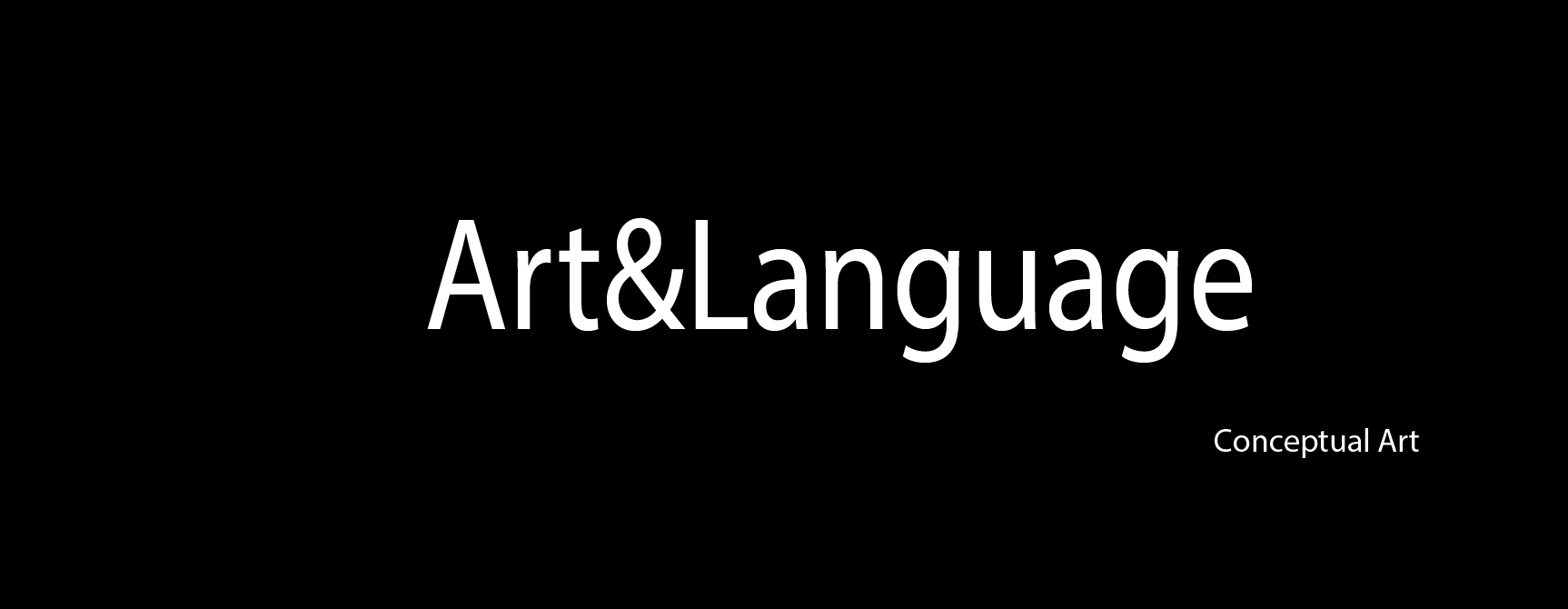
Art&Language
Art & Language is a pioneering English conceptual art group founded in 1968, that questioned the critical assumptions of mainstream modern art practice and criticism. The group was founded in Coventry, England by Michael Baldwin, David Bainbridge, Terry Atkinson and Harold Hurrell. The critic and art historian Charles Harrison and the artist Mel Ramsden both became associated with the group, in 1970.
Their conceptual art privileges the relationship between a work of art and its environment, and a work of art and the observer. Examples are mirrors that have no content and only reflect the environment and/or invite the observer to interact.
Some works address the issue of art that has no physical object, and resorts to text to describe it.
Secret Painting 1967-68 is a black square painted within a black square and thus has nothing in it. But with accompanying block of text next to it in a dyptych frame the same size as the painting stating ‘the content of this painting is invisible. The character and dimension of the content are to be kept permanently secret, known only to the artist. ‘ a sort of joke, using text to indicate that the painting is still a work of art.
https://media.artgallery.nsw.gov.au/collection_images/3/30.2003.a-b%23%23S.jpg
In terms of my own work I am not really sure of the relevance – I find the whole discussion somewhat obscure, self-indulgent and pedantic.
The main points that have some interest for me are that:
- it is possible to produce a image that is completely opaque as a means of attracting the viewer’s attention to a piece of text.
- it is possible to produce an image whose main function is to reflect back to the viewer and leave the interpretation completely to them.
-
Martha Rosler
Martha Rosler is an American artist. She works in photography and photo text, video, installation, sculpture, and performance, as well as writing about art and culture. Rosler’s work is centered on everyday life and the public sphere, often with an eye to women’s experience. Wikipedia
Rosler’s work is quite diverse, but can be seen as underwriiten by four main themes around the question ‘What is subjectivity in the context of late capitalism?’
- Biopolitical: the way that power orchestrates the body, particularly for women. Draws on de Beauvoir, Lefevre and later Foucault.
- Everyday/ordinary/banale and commodification
- Vernacular projects referencing Pop Art, snapshot photography and citizen journalism
- Urbanism an political economy of place
Her work is directly linked to her activism: feminist, anti-power, anti-militarist and in support of human subjectivity. She draws on the theory and practice of ‘estrangement’ of Brecht and Godard where the work invites the viewer to recognise/misrecognise and then deny the content of what they are seeing – leading to critical thinking – leading to taking a position that things should be different.
Website: http://www.martharosler.net
http://www.arthistoryarchive.com/arthistory/feminist/Martha-Rosler.html
Martha Rosler photos and photomontage:
http://home.earthlink.net/~navva/photo/index.htmlRather rambling unfortunately. The Bowery in Two Inadequate Descriptive Systems
She has used image and text in different ways. Some of her work is very effective in exploiting gaps and contradictions between the two ‘descriptive systems’.
This work is a large gallery frieze of a series of photographs of buildings and store fronts with bottles in various positions as traces of events, as a dyptych with ‘poems to alcohol’ – lists of words and phrases referring to drunkenness. They were produced as a counter to what Rosler sees as the voyeuristic and parasitic photography of homeless people and people with alcohol issues with quotations from them that are often taken by students, journalists or NGOs.
I find the unusual juxtaposition of two ‘ descriptive systems’ of image and text that are ‘inadequate’ in themselves to communicate collisions of power very poignant.
Semiotics of the Kitchen
Short video intended for easy showing and distribution shot in single frontal framing. Contrasts single spoken words for everyday kitchen objects with video of possible ways in which they can be used, generally with explicit or implicit violence and a dark feminist humour. House beautiful: bringing the war home
House Beautiful: Bringing the War Back Home is an activist series of collage images that integrate comforting domestic images of American life (mostly from Life Magazine) life with images of the Vietnam war that were shown on TV each evening. She is concerned with the ways in which viewer distancing from identification with people in the photographs is achieved as a means of raising their political awareness. Some of these images are very striking in their juxtaposition and captioning eg ‘Cleaning the Drapes’. These images were photocopied and handed out to protesters on marches, and reprinted later as part of protest against other US comflicts eg Middle East. Other works are much more direct and – I think to a modern audience used to very polished and well-constructed video on what are nowadays common themes – rather cliche. Though the same issues remain.
- Look up
- secrets from the Street
- Middle East photomontages
- Garage
- Passionate Signals
- rites of passage
- airports
-
Barbara Kruger
Barbara Kruger (born January 26, 1945) is an American conceptual artist and collagist. Most of her work consists of black-and-white photographs, overlaid with declarative captions, stated in white-on-red Futura Bold Oblique or Helvetica Ultra Condensed text. The phrases in her works often include pronouns such as “you”, “your”, “I”, “we”, and “they”, addressing cultural constructions of power, identity, and sexuality. Kruger currently lives and works in New York and Los Angeles.
Most important element is the political content, making it clear and bold, though often based on enigmatic images and contradiction.
She works visually with text usually short quotes in bold typeface eg futura, and uses black, white and ‘lipstick’ red, sometimes other bold colours or limited palettes. Sometimes in caps, sometimes lower case and often reversing front and background colours.
Appropriation eg images from 1950s used in 1980s. Silkscreen.
Short introductory overview. Image and Text
Much of Kruger’s work pairs found photographs with pithy and assertive text that challenges the viewer.
Kruger has said that
“I work with pictures and words because they have the ability to determine who we are and who we aren’t.”
A larger category that threads through her work is the appropriation and alteration of existing images. In describing her use of appropriation, Kruger states:
Pictures and words seem to become the rallying points for certain assumptions. There are assumptions of truth and falsity and I guess the narratives of falsity are called fictions. I replicate certain words and watch them stray from or coincide with the notions of fact and fiction.[16]
Her method includes developing her ideas on a computer, later transferring the results (often billboard-sized) into images. Examples of her instantly recognizable slogans read “I shop therefore I am,” and “Your body is a battleground,” appearing in her trademark white letters against a red background. Much of her text calls attention to ideas such as feminism, consumerism, and individual autonomy and desire, frequently appropriating images from mainstream magazines and using her bold phrases to frame them in a new context.
Untitled (Your body is a battleground), 1989

Belief+Doubt (2012) at the Hirshhorn Museum and Sculpture Garden
Kruger discusses how she constructs her work – deciding which elements of the image interests her most, then placing text accordingly. Barbara Kruger discusses her life and work and how it has evolved from magazine cut and paste to large public murals. The questions are the important thing. Enjoys putting questins on a buge mural space. Kruger discusses a collaborative project. It is the questions that are important in having a critical view of the world. Whose values, whose hopes and whose fears? Her poster for the 1989 Women’s March on Washington in support of legal abortion included a woman’s face bisected into positive and negative photographic reproductions, accompanied by the text “Your body is a battleground.” A year later, Kruger used this slogan in a billboard commissioned by the Wexner Center for the Arts. Twelve hours later, a group opposed to abortion responded to Kruger’s work by replacing the adjacent billboard with an image depicting an eight-week-old fetus.
Kruger’s early monochrome pre-digital works, known as ‘paste ups’, reveal the influence of the artist’s experience as a magazine editorial designer during her early career. These small scale works, the largest of which is 11 x 13 inches (28 x 33 cm), are composed of altered found images, and texts either culled from the media or invented by the artist. A negative of each work was then produced and used to make enlarged versions of these initial ‘paste ups’. Between 1978 and 1979, she completed “Picture/Readings,” simple photographs of modest houses alternating with panels of words. From 1992 on, Kruger designed several magazine covers, such as Ms., Esquire, Newsweek, and The New Republic. Her signature font style of Futura Bold type is likely inspired from the “Big Idea” or “Creative Revolution” advertising style of the 1960s that she was exposed to during her experience at Mademoiselle.
In 1990, Kruger scandalized the Japanese American community of Little Tokyo, Los Angeles, with her proposal to paint the Pledge of Allegiance, bordered by provocative questions, on the side of a warehouse in the heart of the historic downtown neighborhood. Kruger had been commissioned by MOCA to paint a mural for “A Forest of Signs: Art in the Crisis of Representation,” a 1989 exhibition that also included works by Barbara Bloom, Jenny Holzer, Jeff Koons, Sherrie Levine, and Richard Prince. But before the mural went up, Kruger herself and curator Ann Goldstein presented it at various community meetings over the time period of 18 months. Only after protests did the artist offer to eliminate the pledge from her mural proposal, while still retaining a series of questions painted in the colours and format of the American flag: “Who is bought and sold? Who is beyond the law? Who is free to choose? Who follows orders? Who salutes longest? Who prays loudest? Who dies first? Who laughs last?”. A full year after the exhibition closed, Kruger’s reconfigured mural finally went up for a two-year run.
In 1994, Kruger’s L’empathie peut changer le monde (Empathy can change the world) was installed on a train station platform in Strasbourg, France. One year later, with architects Henry Smith-Miller and Laurie Hawkinson and landscape architect Nicholas Quennell, she designed the 200-foot-long (60 m) sculptural letters Picture This for a stage and outdoor amphitheater at the North Carolina Museum of Art, Raleigh. Between 1998 and 2008, she created permanent installations for the Fisher College of Business, the Broad Contemporary Art Museum at LACMA, the Moderna Museet, Stockholm, and the Price Center at the University of California, San Diego. For a site-specific piece that she produced at the Parrish Art Museum in 1998, Kruger placed across the upper range of the museum’s Romanesque facade stark red letters that read, “You belong here”; below, on columns separating three arched entry portals, stacked letters spelled “Money” and “Taste.” As part of the Venice Biennale in 2005, Kruger installed a digitally printed vinyl mural across the entire facade of the Italian pavilion, thereby dividing it into three parts—green at the left, red at the right, white in between. In English and Italian, the words “money” and “power” climbed the portico’s columns; the left wall said, “Pretend things are going as planned,” while “God is on my side; he told me so” fills the right.[23] In 2012, her installation Belief+Doubt, which covers 6,700 square feet (620 m²) of surface area and was printed onto wallpaper-like sheets in the artist’s signature colors of red, black and white, was installed at the Hirshhorn Museum and Sculpture Garden.
-
Ed Ruscha
Edward Joseph Ruscha IV (/ruːˈʃeɪ/, roo-SHAY; born December 16, 1937) is an American artist associated with the pop art movement. He has worked in the media of painting, printmaking, drawing, photography, and film. He is also noted for creating several artist’s books.
Ed Ruscha works in a very open-ended way exploiting tension between images and text that often seem rather arbitrary in their juxtaposition, making the viewer make their own connections and interpretations.
His approach is mainly aesthetic – interested in abstract potential of words against abstract design underlying his photographs and paintings. Some commentators on the You Tube videos below have seen this as rather vacuous. What concerns me is the way a focus on ‘cool’ leads to a sort of ‘apathy of the sublime’.
Rapid but pretty comprehensive visual overview of his work: photobooks, painting and text with comments by other artists. Ed Ruscha discusses his exhibition ‘Course of Empire’ at National gallery of large paintings of sections of buildings in LA at two points in time. The first 1990s in black and white and the second 2004 showing changes. References the paintings of rise and fall of civilisation by Thomas Cole on exhibition at National Gallery at the same time.
He discusses how coincidences happen in the making of a work. He does not think too much about meaning and has a compulsion to make things as an ‘involuntary reflex’ as he gets up in the morning. The words come from movies, things he hears on the radio, overheard conversations, things he reads. ‘Things just come out of the air’. Then viewers make up all sorts of meanings and connections.An extended interview where Ed Ruscha discusses how his work evolved from his early journey from Oklahoma (slow and simple) to LA (fast and furious). His first car journey he produced as the photobook 26 Gasolene Stations influenced by Robert Frank, Walker Evans and Jack Kerouac, His work on the Hollywood sign comes from the time in 1960s when he could see it from his window as a ‘weather report’ of smog levels. Not sure where ideas come from, but they do. They come. He has to preconceive ideas and puts recognisable things like words and things. Background in abstract painting, type setting and graphic design. His work is about the tension between images eg landscape, mountain tops and their symbolism ‘not making any noise’ and words that he can overlay in any size. He often uses stencils. Experiments with gunpowder. He discusses his photobooks of gasolene stations, parking lots and swimming pools. He describes them as not having any political point, aiming for a cool distance and ‘no style’. But of gasolene stations he also says ‘ what used to be Navaho land now belongs to the white man to put gasolene stations on.’ The work on parking lots and swimming pools seen from a helicopter also point to something (what? Waste? Wealth? Emptiness?) about life in LA. Discusses the ways he works across media, particularly etchings. -
Lawrence Weiner
Lawrence Charles Weiner (February 10, 1942 – December 2, 2021) was an American conceptual artist. He was one of the central figures in the formation of conceptual art in the 1960s. His work often took the form of typographic texts, a form of word art.
http://www.artnet.com/artists/lawrence-weiner/
https://www.lissongallery.com/artists/lawrence-weiner
.jpg)