Littler has said “I was always scared as a kid, always frightened of what I was faced with. … You’d walk into WHSmith… and see horror books with people’s faces melting. Kids’ TV included things like Children of the Stones, a very odd series you just wouldn’t get today. I remember a public information film made by some train organisation in which a children’s sports day was held on train tracks and, one by one, they were killed. It was insane. … I’m just taking it to the next logical step.
Scarfolk is a fictional northern English town created by writer and designer Richard Littler, who is sometimes identified as the town mayor. First published as a blog of fake historical documents, parodying British public information posters of the 1970s, a collected book was published in 2014.
Scarfolk, which is forever locked in the 1970s, is a satire not only on that decade but also on contemporary events. It touches on themes of totalitarianism, suburban life, occultism and religion, school and childhood, as well as social attitudes such as racism and sexism.
Scarfolk was initially presented as a fake blog which purportedly releases artefacts from the town council’s archive. Artefacts include public information literature, out-of-print books, record and cassette sleeves, advertisements, television programme screenshots, household products, and audio and video, many of which suggest brands and imagery recognisable from the period. Additionally, artefacts are usually accompanied by short fictional vignettes which are also presented as factual and introduce residents of Scarfolk. The public information literature often ends with the strapline: “For more information please reread.”
The aesthetic is utilitarian, inspired by public sector materials in the United Kingdom such as Protect and Survive.
A television series co-written by Will Smith was described as “in the works” in 2018.
Victore’s position comes across loud and direct with his statement,
‘Graphic Design is a club with big f***king spikes in, and I want to wield it.’
His interest in social and political agendas follows the same direction as Garland’s in orientating his work for more ‘useful’ objectives.
In 2005 the director David Hillman Curtis started making a series of short films recording artists, designers, illustrators, and architects talking about their ideas and process. One of these films featured the poster designer James Victore. Hillman said: I chose to film James because of his posters. I didn’t know him or much about him at the time, but I had seen a few of his pieces and had fallen in love with them. I also liked that he was doing work that was politically subversive at a time – the height of the Bush Administration’s popularity – when it seemed as if a lot of creative people were too discouraged to do so. James was very outspoken during the interview, using foul language and cussing out politicians. I kept this stuff in the film and lost Adobe as a sponsor because of it.
Shirin Neshat (Persian: شیرین نشاط; born March 26, 1957) is an Iranian visual artist who lives in New York City, known primarily for her work in film, video and photography.
Her artwork centres around the contrasts between Islam and the West, femininity and masculinity, public life and private life, antiquity and modernity, and bridging the spaces between these subjects. Neshat often emphasizes this theme showing two or more coordinated films concurrently, creating stark visual contrasts through motifs such as light and dark, black and white, male and female.
Although Neshat actively resists stereotypical representations of Islam, her artistic objectives are not explicitly polemical. Rather, her work recognizes the complex intellectual and religious forces shaping the identity of Muslim women throughout the world. Using Persian poetry and calligraphy she examined concepts such as martyrdom, the space of exile, the issues of identity and femininity.
Neshat has been recognized countless times for her work, from winning the International Award of the XLVIII Venice Biennalein 1999, to winning the Silver Lion for best director at the 66th Venice Film Festival in 2009, to being named Artist of the Decade by Huffington Post critic G. Roger Denson.
In July 2009 Neshat took part in a three-day hunger strike at the United Nations Headquarters in New York in protest of the 2009 Iranian presidential election.
Work
Neshat’s earliest works were photographs exploring notions of femininity in relation to Islamic fundamentalism and militancy in her home country as a way of coping with the discrepancy between the culture that she was experiencing and that of the pre-revolution Iran in which she was raised.
Unveiling (1993):
Women of Allah (1993–97): portraits of women entirely overlaid by Persian calligraphy.
Logic of the Birds 2001-02 a full-length multimedia production with singer Sussan Deyhim andproduced by curator and art historian RoseLee Goldberg. Neshat uses sound to help create an emotionally evocative and beautiful piece that will resonate with viewers of both Eastern and Western cultures.
Neshat has also made more traditional narrative short films, such as Zarin.
Turbulent, 1998. Two channel video/audio installation.
Rapture, 1999. Two channel video/audio installation.
Soliloquy, 1999. Color video/audio installation with artist as the protagonist.
Fervor, 2000. Two channel video/audio installation.
Passage, 2001. Single channel video/audio installation.
Logic of the Birds, 2002. Multi-media performance.
Tooba, 2002. Two channel video/audio installation based on Shahrnush Parsipur’s novel Women Without Men.
Mahdokht, 2004. Three channel video/audio installation.
Zarin, 2005. Single channel video/audio installation.
Munis, 2008. Color video/audio installation based on Shahrnush Parsipur’s novel Women Without Men.
Faezeh, 2008. Color video/audio installation based on Shahrnush Parsipur’s novel Women Without Men.
Possession, 2009. Black & white video/audio installation.
Women Without Men, 2009. Feature film based on Shahrnush Parsipur’s novel Women Without Men.
Illusions & Mirrors, 2013. Film commissioned by Dior and featuring Natalie Portman.
Biography
Neshat is the fourth of five children of wealthy parents, brought up in the religious town of Qazvin in north-western Iran under a “very warm, supportive Muslim family environment”, where she learned traditional religious values through her maternal grandparents. Neshat’s father was a physician and her mother a homemaker. Neshat said that her father, “fantasized about the west, romanticized the west, and slowly rejected all of his own values; both my parents did. What happened, I think, was that their identity slowly dissolved, they exchanged it for comfort. It served their class”.
As a part of Neshat’s “Westernization” she was enrolled in a Catholic boarding school in Tehran. Through her father’s acceptance of Western ideologies came an acceptance of a form of western feminism. Neshat’s father encouraged each of his daughters to “be an individual, to take risks, to learn, to see the world”, and he sent his daughters as well as his sons to college to receive their higher education.
In 1975, Neshat left Iran to study art at UC Berkeley and completed her BA, MA and MFA.
After graduating school, she moved to New York and married a Korean curator, Kyong Park, who was the director and founder of Storefront for Art and Architecture, a non-profit organization. Neshat helped Park run the Storefront, where she was exposed to many different ideologies and it would become a place where she received a much needed experience with and exposure to concepts that would later become integral to her artwork.
During this time, she did not make any serious attempts at creating art, and the few attempts were subsequently destroyed.
In 1990, she returned to Iran. “It was probably one of the most shocking experiences that I have ever had. The difference between what I had remembered from the Iranian culture and what I was witnessing was enormous. The change was both frightening and exciting; I had never been in a country that was so ideologically based. Most noticeable, of course, was the change in people’s physical appearance and public behaviour.
Experimented with ripped pages, fluoro paper and deliberate print errors to create a raw and dissonant aesthetic for a special collected edition of spy comic zero.
Irma Boom (born 15 December 1960) is a Dutch graphic designer who specializes in bookmaking. Her innovative and experimental designs often blur the lines between art and literature, challenging the convention of traditional books in both physical design and printed content. Boom has been described as the “Queen of Books,” having created over 300 books and is well reputed for her artistic autonomy within her field. Boom’s work earned her numerous awards and accolades, highlighting her status as a visionary in the field.
Guerilla Girls, a feminist group fighting sexism in arts practice. Formed in New York in 1985, the group maintain their anonymity by wearing gorilla masks and using the names of dead female artists as pseudonyms, e.g. Frida Kahlo and Hannah HÖch.
They put pressure on organisations such as the Metropolitan Museum of Art in New York by uncovering statistics that reveal the extent of patriarchy in the art world past and present. The original group disbanded in 2001 but several Guerrilla Girl spin-offs still exist.
Recent campaigns include ‘Unchain female directors’ targeted at the male-dominated world of the Hollywood film studio.
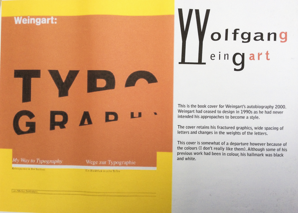
Wolfgang Weingart (born 1941 in the Salem Valley in southern Germany) is an internationally known graphic designer and typographer.
His work is categorized as Swiss typography and he is credited as “the father” of New Wave or Swiss Punk typography.
“I took ‘Swiss Typography’ as my starting point, but then I blew it apart, never forcing any style upon my students. I never intended to create a ‘style’. It just happened that the students picked up—and misinterpreted—a so-called ‘Weingart style’ and spread it around.” Weingart
Weingart spent his childhood in Germany, moving briefly to Lisbon in 1954 with his family. In April 1958 he returned to Germany and studied typesetting, linocut and woodblock printing at the Merz Academy in Stuttgart . He then completed a three-year typesetting apprenticeship in hot metal hand composition at Ruwe Printing. From 1963 he has been based at Basel School of Design as a student and from 1968 – 2005 as teacher of typography. He was a member of the Alliance Graphique Internationale (AGI) from 1978 to 1999. From1970 to 1988 he was on the editorial board of Typographische Monatsblätter magazine.
Publications
Weingart, Wolfgang. Weingart: Typography—My Way to Typography, a retrospective volume in ten sections, Baden: Lars Müller Publishers, 2000 (ISBN 978-3907044865)
Knapp, Susan, Eppelheimer, Michael, Hofmann Dorothea et al. Weingart: The Man and the Machine, statements by 77 of his students at the Basel School of Design (1968–2004), Basel: Karo Publishing, 2014 (ISBN 3-9521009-7-8)
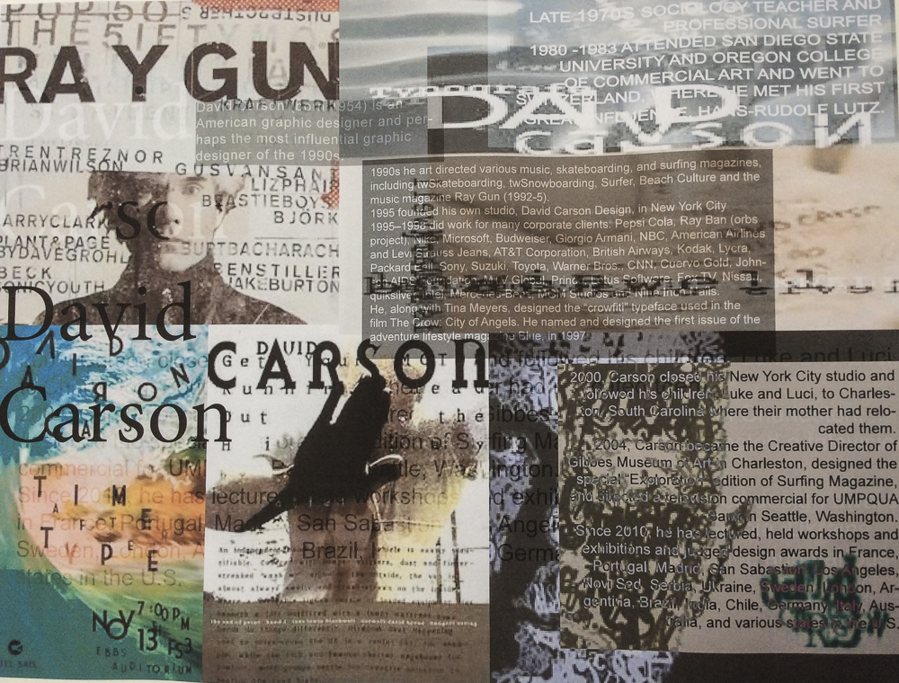
David Carson (born September 8, 1954) is an American graphic designer, art director and surfer. He is best known for his innovative magazine design, and use of experimental typography.
He worked as a sociology teacher and professional surfer in the late 1970s. From 1982 to 1987, Carson worked as a teacher in Torrey Pines High School in San Diego, California. In 1983, Carson started to experiment with graphic design and found himself immersed in the artistic and bohemian culture of Southern California. He art directed various music, skateboarding, and surfing magazines through the 1980/90s, including twSkateboarding, twSnowboarding, Surfer, Beach Culture and the music magazine Ray Gun. By the late 1980s he had developed his signature style, using “dirty” type and non-mainstream photographic techniques.
As art director of Ray Gun (1992-5) he employed much of the typographic and layout style for which he is known. In particular, his widely imitated aesthetic defined the so-called “grunge typography” era. In one issue he used Dingbat as the font for what he considered a rather dull interview with Bryan Ferry. In a feature story, NEWSWEEK magazine said he “changed the public face of graphic design”.
He takes photography and type and manipulates and twists them together and on some level confusing the message but in reality he was drawing the eyes of the viewer deeper within the composition itself. His layouts feature distortions or mixes of ‘vernacular’ typefaces and fractured imagery, rendering them almost illegible. Indeed, his maxim of the ‘end of print’ questioned the role of type in the emergent age of digital design, following on from California New Wave and coinciding with experiments at the Cranbrook Academy of Art.
In the later 1990s he added corporate clients to his list of clients, including Microsoft, Armani, Nike, Levi’s, British Airways, Quiksilver, Sony, Pepsi, Citibank, Yale University, Toyota and many others. When Graphic Design USA Magazine (NYC) listed the “most influential graphic designers of the era” David was listed as one of the all time 5 most influential designers, with Milton Glaser, Paul Rand, Saul Bass and Massimo Vignelli.
He named and designed the first issue of the adventure lifestyle magazine Blue, in 1997. David designed the first issue and the first three covers, after which his assistant Christa Smith art directed and designed the magazine until its demise. Carson’s cover design for the first issue was selected as one of the “top 40 magazine covers of all time” by the American Society of Magazine Editors.
In 2000, Carson closed his New York City studio and followed his children, Luke and Luci, to Charleston, South Carolina where their mother had relocated them. In 2004, Carson became the Creative Director of Gibbes Museum of Art in Charleston, designed the special “Exploration” edition of Surfing Magazine, and directed a television commercial for UMPQUA Bank in Seattle, Washington.
Carson claims that his work is “subjective, personal and very self indulgent”.
Bibliography
Carson, David (1995). The End of Print: The Graphic Design of David Carson. Chronicle Books. ISBN 0-8118-1199-9.
Carson, David (1997). David Carson: 2nd Sight: Grafik Design After the End of Print. Universe Publishing. ISBN 0-7893-0128-8.
Meggs, Phillip B.; David Carson (1999). Fotografiks: An Equilibrium Between Photography and Design Through Graphic Expression That Evolves from Content. Laurence King. ISBN 1-85669-171-3.
Stecyk, Craig; David Carson (2002). Surf Culture: The Art History of Surfing. Laguna Art Museum in association with Gingko Press. ISBN 1-58423-113-0.
Mcluhan, Marshall; David Carson, Eric McLuhan, Terrance Gordon (2003). The Book of Probes. Gingko Press. ISBN 1-58423-056-8.
Carson, David (2004). Trek: David Carson, Recent Werk. Gingko Press. ISBN 1-58423-046-0.
Mayne, Thom; David Carson (2005). Ortlos: Architecture of the Networks. Hatje Cantz Publishers. ISBN 3-7757-1652-1.