Tag: typographer

  • Jan Tschichold

    Jan Tschichold

    Jan Tschichold (1902- 1974) was a typographer, book designer, teacher and writer.

    Modernism: Die neue Typographie 

    Tschichold became a convert to Modernist design principles in 1923 after visiting the first Weimar Bauhaus exhibition. He wrote an influential 1925 magazine supplement; then had a 1927 personal exhibition. The book ‘Die Neue Typographie’ was a manifesto of his theories of modern design and codified many other Modernist design rules:

    • importance of machine composition
    • use of standardised paper sizes for all printed matter
    • effective use of  sans serif (Grotesque) typefaces using different sizes and weights of type in order to quickly and easily convey information.
    • non-centred design and asymmetrical placing of contrasting elements with flush left headlines of irregular lengths
    • layouts based on horizontal and vertical underlying grids with spatial interval and empty spaces employed as design components.

    He advocated the Van de Graaf canon based on proportions in medieval manuscripts and based on Golden Section used in book design to divide a page in pleasing proportions.
     
    This book was followed with a series of practical manuals on the principles of Modernist typography which had a wide influence among ordinary workers and printers in Germany.

    Return to Classicism

    Tschichold slowly abandoned his rigid beliefs from around 1932 onwards (e.g. his Saskia typeface of 1932, and his acceptance of classical Roman typefaces for body-type) as he moved back towards Classicism in print design. He later condemned Die neue Typographie as too extreme. He also went so far as to condemn Modernist design in general as being authoritarian and inherently fascistic. He now advocated:

    • symmetrical typographic treatments as more appropriate for great works of literature.
    • classical typefaces like Garamond, Janson, Baskerville and Bell because of legibility
    • importance of grids underlying layout design.
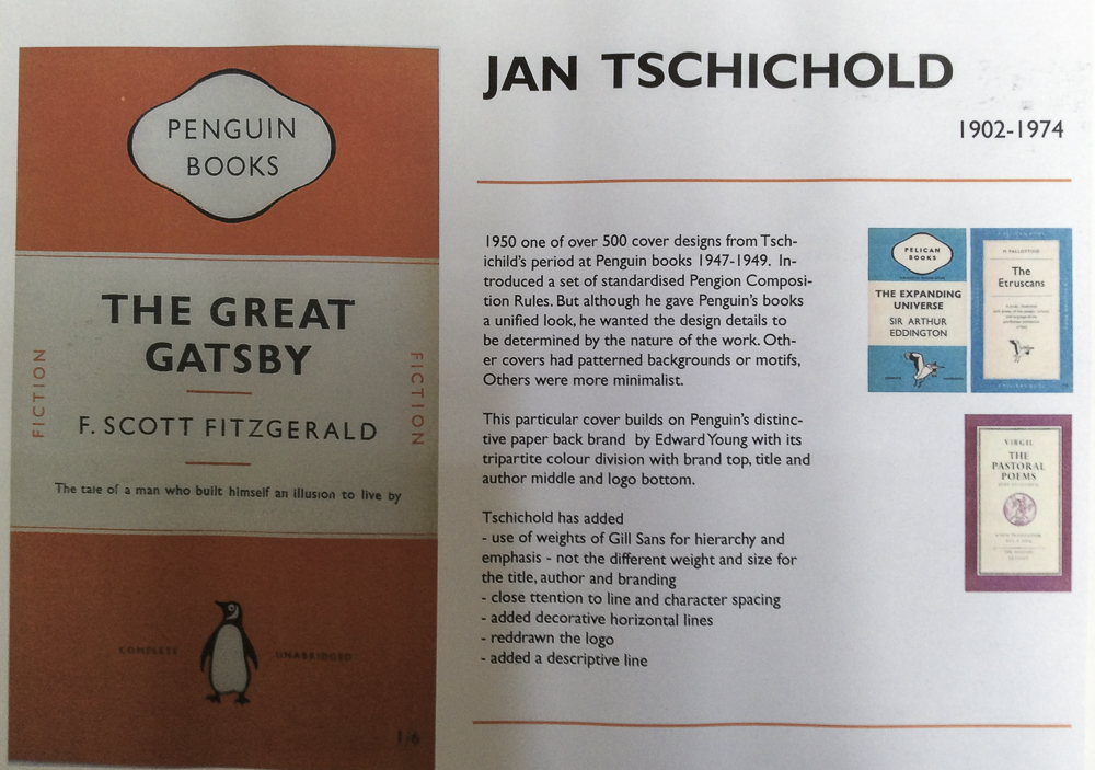
       

    Penguin Books

    Between 1947–1949 Tschichold lived in England where he oversaw the redesign of 500 paperbacks published by Penguin Books, leaving them with a standardized set of typographic rules, the Penguin Composition Rules. Although he gave Penguin’s books (particularly the Pelican range) a unified look and enforced many of the typographic practices that are taken for granted today, he allowed the nature of each work to dictate its look, with varied covers and title pages. In working for a firm that made cheap mass-market paperbacks, he was following a line of work—in cheap popular culture forms (e.g. film posters)—that he had always pursued during his career.

    Typefaces

    His abandonment of Modernist principles meant that, even though he was living in Switzerland after the war, he was not at the centre of the post-war Swiss International Typographic Style. Unimpressed by the use of realist or neo-grotesque typefaces, which he saw as a revival of poorly-designed models, his survey of typefaces in advertising deliberately made no mention of such designs, save for a reference to ‘survivals from the nineteenth-century which have recently enjoyed a short-lived popularity.’
     
    Sabon typeface 1967 is the best known.
     
    Between 1926 and 1929, he designed a “universal alphabet” to clean up the few multigraphs and non-phonetic spellings in the German language. For example, he devised brand new characters to replace the multigraphs ch and sch. His intentions were to change the spelling by systematically replacing eu with oi, w with v, and z with ts. Long vowels were indicated by a macron below them, though the umlaut was still above. The alphabet was presented in one typeface, which was sans-serif and without capital letters.
    Other typefaces: Transit (1931), Saskia (1931/1932) and Zeus (1931).

    Biography

    (edited from Wikipedia)

    Tschichold was the son of a provincial signwriter, and unlike most other typographers of his time, was trained in calligraphy. This may help explain why he never worked with handmade papers and custom fonts as many typographers did, preferring instead to use stock fonts on a careful choice from commercial paper stocks.

    After the election of Hitler in Germany, all designers had to register with the Ministry of Culture, and all teaching posts were threatened for anyone who was sympathetic to communism. Soon after Tschichold had taken up a teaching post in Munich at the behest of Paul Renner, they both were denounced as “cultural Bolshevists”. Ten days after the Nazis surged to power in March 1933, Tschichold and his wife were arrested. During the arrest, Soviet posters were found in his flat, casting him under suspicion of collaboration with communists. All copies of Tschichold’s books were seized by the Gestapo “for the protection of the German people”. After six weeks a policeman somehow found him tickets for Switzerland, and he and his family managed to escape Nazi Germany in August 1933.

    Apart from two longer stays in England in 1937 (at the invitation of the Penrose Annual), and 1947–1949 (at the invitation of Ruari McLean, the British typographer, with whom he worked on the design of Penguin Books), Tschichold lived in Switzerland for the rest of his life. Jan Tschichold died in the hospital at Locarno in 1974.

  • James Goggin

    James Goggin is a Chicago-based British and/or Australian art director and graphic designer from London via Sydney, Stockholm, Copenhagen, Auckland, and Arnhem. Together with partner Shan James, he runs a design practice named Practise working with clients across Europe, Asia, Australasia, and North America. James has taught at design schools in Europe, Australasia, and the United States, including Werkplaats Typografie, Ecole cantonale d’art de Lausanne (ECAL), and at Rhode Island School of Design, where he is currently a visiting thesis critic. He frequently gives lectures and runs workshops around the world, and occasionally writes about art and design practice. His work is included in the permanent collections of the Victoria and Albert Museum, the Art Institute of Chicago, and the Chicago Design Archive, and he has been a member of Alliance Graphique Internationale since 2010.

    Mass Contacts Dialogues

    Practice website    archive

    It’s Nice That

  • James Victore

    https://www.jamesvictore.com

    Victore’s position comes across loud and direct with his statement,

    ‘Graphic Design is a club with big f***king spikes in, and I want to wield it.’

    His interest in social and political agendas follows the same direction as Garland’s in orientating his work for more ‘useful’ objectives.

    In 2005 the director David Hillman Curtis started making a series of short films recording artists, designers, illustrators, and architects talking about their ideas and process. One of these films featured the poster designer James Victore. Hillman said: I chose to film James because of his posters. I didn’t know him or much about him at the time, but I had seen a few of his pieces and had fallen in love with them. I also liked that he was doing work that was politically subversive at a time – the height of the Bush Administration’s popularity – when it seemed as if a lot of creative people were too discouraged to do so. James was very outspoken during the interview, using foul language and cussing out politicians. I kept this stuff in the film and lost Adobe as a sponsor because of it.

  • Wolfgang Weingart

    Wolfgang Weingart

    Wolfgang Weingart (born 1941 in the Salem Valley in southern Germany) is an internationally known graphic designer and typographer.

    His work is categorized as Swiss typography and he is credited as “the father” of New Wave or Swiss Punk typography.

      “I took ‘Swiss Typography’ as my starting point, but then I blew it apart, never forcing any style upon my students. I never intended to create a ‘style’. It just happened that the students picked up—and misinterpreted—a so-called ‘Weingart style’ and spread it around.” Weingart

    For his typography click here

    Weingart spent his childhood in Germany, moving briefly to Lisbon in 1954 with his family. In April 1958 he returned to Germany and studied typesetting, linocut and woodblock printing at the Merz Academy in Stuttgart . He then  completed a three-year typesetting apprenticeship in hot metal hand composition at Ruwe Printing.  From 1963 he has been based at Basel School of Design as a student and from 1968 – 2005 as teacher of typography. He was a member of the Alliance Graphique Internationale (AGI) from 1978 to 1999. From1970 to 1988 he was on the editorial board of Typographische Monatsblätter magazine.

    Publications

    Weingart, Wolfgang. Weingart: Typography—My Way to Typography, a retrospective volume in ten sections, Baden: Lars Müller Publishers, 2000 (ISBN 978-3907044865)

    Knapp, Susan, Eppelheimer, Michael, Hofmann Dorothea et al. Weingart: The Man and the Machine, statements by 77 of his students at the Basel School of Design (1968–2004), Basel: Karo Publishing, 2014 (ISBN 3-9521009-7-8)

  • David Carson

    David Carson

    David Carson (born September 8, 1954) is an American graphic designer, art director and surfer. He is best known for his innovative magazine design, and use of experimental typography.

    He worked as a sociology teacher and professional surfer in the late 1970s. From 1982 to 1987, Carson worked as a teacher in Torrey Pines High School in San Diego, California. In 1983, Carson started to experiment with graphic design and found himself immersed in the artistic and bohemian culture of Southern California. He art directed various music, skateboarding, and surfing magazines through the 1980/90s, including twSkateboarding, twSnowboarding, Surfer, Beach Culture and the music magazine Ray Gun. By the late 1980s he had developed his signature style, using “dirty” type and non-mainstream photographic techniques.

    As art director of Ray Gun (1992-5) he employed much of the typographic and layout style for which he is known. In particular, his widely imitated aesthetic defined the so-called “grunge typography” era.  In one issue he used Dingbat as the font for what he considered a rather dull interview with Bryan Ferry. In a feature story, NEWSWEEK magazine said he “changed the public face of graphic design”.

    He takes photography and type and manipulates and twists them together and on some level confusing the message but in reality he was drawing the eyes of the viewer deeper within the composition itself. His layouts feature distortions or mixes of ‘vernacular’ typefaces and fractured imagery, rendering them almost illegible. Indeed, his maxim of the ‘end of print’ questioned the role of type in the emergent age of digital design, following on from California New Wave and coinciding with experiments at the Cranbrook Academy of Art.

    In the later 1990s he added corporate clients to his list of clients, including Microsoft, Armani, Nike, Levi’s, British Airways, Quiksilver, Sony, Pepsi, Citibank, Yale University, Toyota and many others. When Graphic Design USA Magazine (NYC) listed the “most influential graphic designers of the era” David was listed as one of the all time 5 most influential designers, with Milton Glaser, Paul Rand, Saul Bass and Massimo Vignelli.

    He named and designed the first issue of the adventure lifestyle magazine Blue, in 1997. David designed the first issue and the first three covers, after which his assistant Christa Smith art directed and designed the magazine until its demise. Carson’s cover design for the first issue was selected as one of the “top 40 magazine covers of all time” by the American Society of Magazine Editors.

    In 2000, Carson closed his New York City studio and followed his children, Luke and Luci, to Charleston, South Carolina where their mother had relocated them. In 2004, Carson became the Creative Director of Gibbes Museum of Art in Charleston, designed the special “Exploration” edition of Surfing Magazine, and directed a television commercial for UMPQUA Bank in Seattle, Washington.

    Carson claims that his work is “subjective, personal and very self indulgent”.

    Bibliography

    Carson, David (1995). The End of Print: The Graphic Design of David Carson. Chronicle Books. ISBN 0-8118-1199-9.

    Carson, David (1997). David Carson: 2nd Sight: Grafik Design After the End of Print. Universe Publishing. ISBN 0-7893-0128-8.

    Meggs, Phillip B.; David Carson (1999). Fotografiks: An Equilibrium Between Photography and Design Through Graphic Expression That Evolves from Content. Laurence King. ISBN 1-85669-171-3.

    Stecyk, Craig; David Carson (2002). Surf Culture: The Art History of Surfing. Laguna Art Museum in association with Gingko Press. ISBN 1-58423-113-0.

    Mcluhan, Marshall; David Carson, Eric McLuhan, Terrance Gordon (2003). The Book of Probes. Gingko Press. ISBN 1-58423-056-8.

    Carson, David (2004). Trek: David Carson, Recent Werk. Gingko Press. ISBN 1-58423-046-0.

    Mayne, Thom; David Carson (2005). Ortlos: Architecture of the Networks. Hatje Cantz Publishers. ISBN 3-7757-1652-1.