Tag: Western design

  • Filippo Marinetti

    Filippo Marinetti

    Edited from Wikipedia article

    Marinetti typography  Google images

    Marinetti is known best as the author of the Futurist Manifesto, which he wrote in 1909. It was published in French on the front page of the most prestigious French daily newspaper, Le Figaro, on 20 February 1909. In The Founding and Manifesto of Futurism, Marinetti declared that:

    “Art, in fact, can be nothing but violence, cruelty, and injustice.”

    Futurism

    See post: Futurism

    Futurism had both anarchist and Fascist elements; Marinetti later became an active supporter of Benito Mussolini.

    Marinetti, who admired speed, had a minor car accident outside Milan in 1909 when he veered into a ditch to avoid two cyclists. He referred to the accident in the Futurist Manifesto: the Marinetti who was helped out of the ditch was a new man, determined to end the pretense and decadence of the prevailing Liberty style. He discussed a new and strongly revolutionary programme with his friends, in which they should end every artistic relationship with the past, “destroy the museums, the libraries, every type of academy”. Together, he wrote, “We will glorify war—the world’s only hygiene—militarism, patriotism, the destructive gesture of freedom-bringers, beautiful ideas worth dying for, and scorn for woman”.

    The Futurist Manifesto was read and debated all across Europe, but Marinetti’s first ‘Futurist’ works were not as successful. In April, the opening night of his drama Le Roi bombance (The Feasting King), written in 1905, was interrupted by loud, derisive whistling by the audience… and by Marinetti himself, who thus introduced another element of Futurism, “the desire to be heckled”. Marinetti did, however, fight a duel with a critic he considered too harsh.

    Writings and sound poems

    His drama La donna è mobile (Poupées électriques), first presented in Turin, was not successful either. Nowadays, the play is remembered through a later version, named Elettricità sessuale(Sexual Electricity), and mainly for the appearance onstage of humanoid automatons, ten years before the Czech writer Josef Čapek would invent the term “robot”. In 1910, his first novel Mafarka il futurista was cleared of all charges by an obscenity trial.

    That year, Marinetti discovered some allies in three young painters, (Umberto Boccioni, Carlo Carrà, Luigi Russolo), who adopted the Futurist philosophy. Together with them (and with poets such as Aldo Palazzeschi), Marinetti began a series of Futurist Evenings, theatrical spectacles in which Futurists declaimed their manifestos in front of a crowd that in part attended the performances in order to throw vegetables at them.

    The most successful “happening” of that period was the publicization of the “Manifesto Against Past-Loving Venice” in Venice. In the flier, Marinetti demands “fill(ing) the small, stinking canals with the rubble from the old, collapsing and leprous palaces” to “prepare for the birth of an industrial and militarized Venice, capable of dominating the great Adriatic, a great Italian lake”.

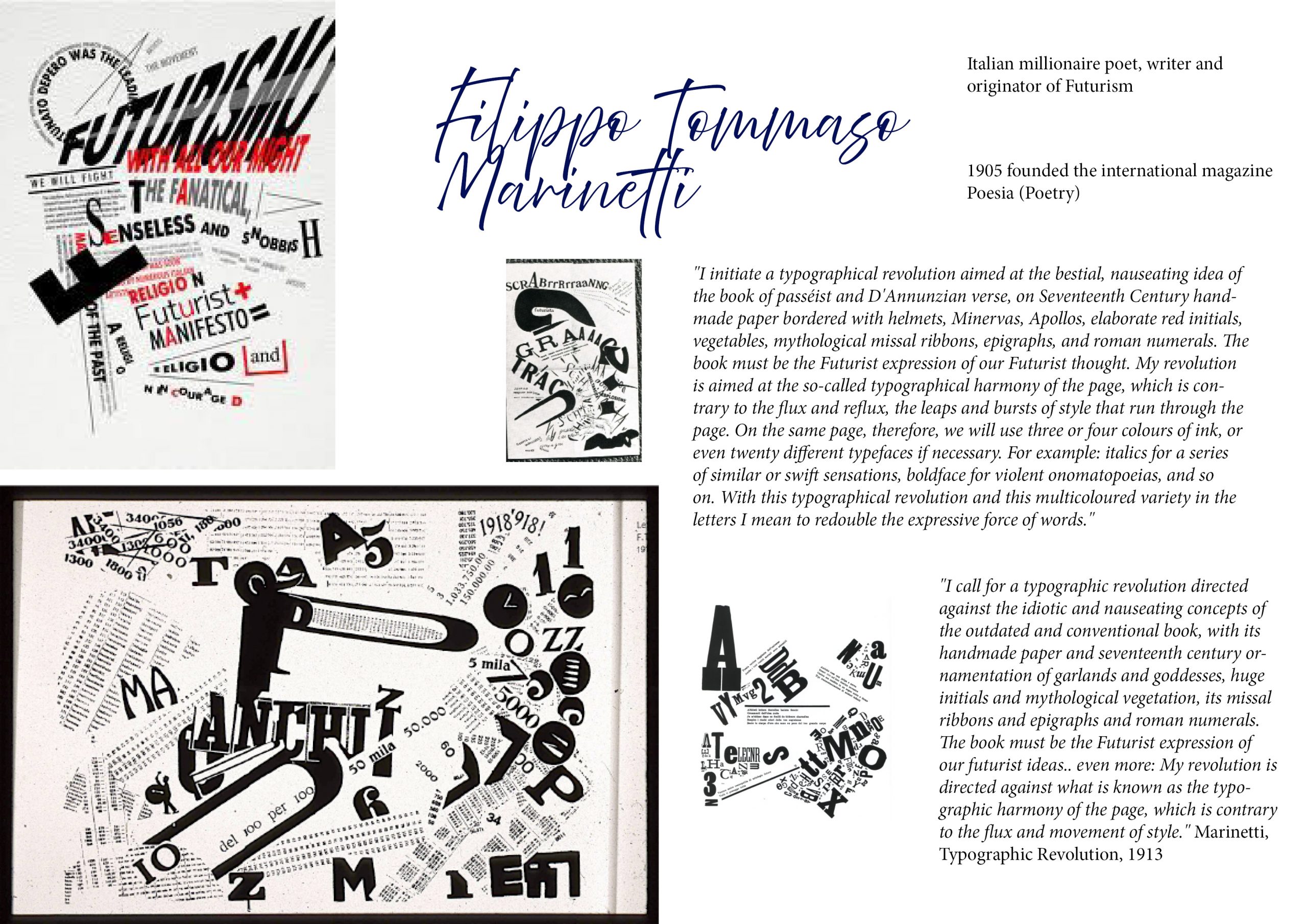
    About the same time Marinetti edited an anthology of futurist poets. But his attempts to renew the style of poetry did not satisfy him. So much so that, in his foreword to the anthology, he declared a new revolution: it was time to be done with traditional syntax and to use “words in freedom” (parole in libertà). His sound-poem Zang Tumb Tumb exemplifies words in freedom. Recordings can be heard of Marinetti reading some of his sound poems: Battaglia, Peso + Odore(1912) Dune, parole in libertà (1914) La Battaglia di Adrianopoli (1926) (recorded 1935)

     Fascism

    Many Italian Futurists supported Fascism in the hope of modernizing a country divided between the industrialising north and the rural, archaic South. Like the Fascists, the Futurists were Italian nationalists, radicals, admirers of violence, and were opposed to parliamentary democracy. Marinetti founded the Futurist Political Party (Partito Politico Futurista) in early 1918, which was absorbed into Benito Mussolini’s Fasci di combattimento in 1919, making Marinetti one of the first members of the National Fascist Party. He opposed Fascism’s later exaltation of existing institutions, calling them “reactionary”, and walked out of the 1920 Fascist party congress in disgust, withdrawing from politics for three years; but he supported Italian Fascism until his death in 1944. The Futurists’ association with Fascism after its triumph in 1922 brought them official acceptance in Italy and the ability to carry out important work, especially in architecture. After the Second World War, many Futurist artists had difficulty in their careers because of their association with a defeated and discredited regime. Marinetti sought to make Futurism the official state art of Fascist Italy but failed to do so.

    Mussolini was personally uninterested in art and chose to give patronage to numerous styles and movements in order to keep artists loyal to the regime. Opening the exhibition of art by the Novecento Italiano group in 1923, he said, “I declare that it is far from my idea to encourage anything like a state art. Art belongs to the domain of the individual. The state has only one duty: not to undermine art, to provide humane conditions for artists, to encourage them from the artistic and national point of view.” Mussolini’s mistress, Margherita Sarfatti, who was as able a cultural entrepreneur as Marinetti, successfully promoted the rival Novecento group, and even persuaded Marinetti to sit on its board. Although in the early years of Italian Fascism modern art was tolerated and even embraced, towards the end of the 1930s, right-wing Fascists introduced the concept of “degenerate art” from Germany to Italy and condemned Futurism.

    Marinetti made numerous moves to ingratiate himself with the regime, becoming less radical and avant-garde with each. He moved from Milan to Rome to be nearer the centre of things. He became an academician despite his condemnation of academies, married despite his condemnation of marriage, promoted religious art after the Lateran Treaty of 1929 and even reconciled himself to the Catholic Church, declaring that Jesus was a Futurist.

  • Kurt Schwitters

    Kurt Hermann Eduard Karl Julius Schwitters (1887 –  1948) was a German artist painter, sculptor, graphic designer, typographer and writer. He worked in several genres and media, including Dada, Constructivism, Surrealism, poetry, sound, and what came to be known as installation art. He is most famous for his collages, called Merz Pictures.

    Studied at the School of Arts and Crafts in Hanover 1908-9 and at Dresden Academy 1909-14.

    Influenced by Expressionism and Cubism 1917-18.

    In 1918 created his own form of Dada in Hanover called ‘Merz’, using rubbish materials such as labels, bus tickets and bits of broken wood in his collages and constructions. Friendship with Arp, Hausmann and van Doesburg. Published the first edition of Anna Blume (a collection of poems and prose pieces) in 1919 and the magazine Merz 1923-32. First one-man exhibition at the Galerie Der Sturm, Berlin, 1920. Began in 1923 to build fantastic Merz constructions in his house in Hanover (the first ‘Merzbau’).

    Spent the summers in Norway from 1931 and emigrated in 1937 to Lysaker near Oslo. Fled to England in 1940, spent seventeen months in internment camps, then lived 1941-5 in London. Moved in 1945 to Ambleside in the Lake District. In the last months of his life, he began a further Merz construction in an old barn at Langdale. Died at Kendal.

    See Wikipedia article

    Colour and Collage

    Ursonate Sound Poem

  • Joseph Muller Brockman

    Josef Müller-Brockmann (May 9, 1914 – August 30, 1996) was a Swiss graphic designer and teacher. He is recognised for his simple designs and his clean use of typography (notably Akzidenz-Grotesk), shapes and colours which inspire many graphic designers in the 21st century.

    Each letter has its own personality …the forms of letters can create simultaneously both tension and nobility…The new typography differs from the old in that it is the first to try to develop the outward appearance from the function of the text…uses the background as an element of design which is on a par with other elements.
    (Muller-Brockman)

    Work and books

    Many of Müller-Brockmann’s works can be found in the online gallery “Blanka”

    Müller-Brockman was author of several books on design and visual communication.

    • The Graphic Artist and his Design Problems (Gestaltungsprobleme des Grafikers), Teufen, 1961
    • A History of Visual Communication (Geschichte der visuellen Kommunikation), Niederteufen, 1971
    • History of the Poster (Geschichte des Plakates), co-author Shizuko Yoshikawa, Zurich, 1971
    • Grid Systems in Graphic Design (Rastersysteme für die visuelle Gestaltung), Niederteufen, 1981
    • Graphic Design in IBM: Typography, Photography, Illustration, Paris, 1988
    • Fotoplakate: Von den Anfängen bis zur Gegenwart, co-author Karl Wobmann, Aarau, 1989
    • Mein Leben: Spielerischer Ernst und ernsthaftes Spiel (autobiography), Baden, 1994

    Biography

    Muller-Brockmann studied architecture, design and history of art at both the University and Kunstgewerbeschule in Zürich. In 1936 he opened his Zurich studio specialising in graphic design, exhibition design and photography. From 1951 he produced concert posters for theTonhalle in Zurich. In 1958 he became a founding editor of New Graphic Design along with R.P. Lohse, C. Vivarelli, and H. Neuburg. In 1966 he was appointed European design consultant to IBM.

    See:
    Layout
    Modernist Typography

  • Neville Brody

    Neville Brody

    Neville Brody (born 23 April 1957 in London) is an English graphic designer, typographer and art director. Influenced by Punk, Dada and Pop Art. He is the  Head of the Communication Art & Design department at the Royal College of Art.

    In 1988 Thames & Hudson published the first of two volumes about his work, which became the world’s best selling graphic design book. Combined sales now exceed 120,000. An accompanying exhibition of his work at the Victoria and Albert Museum attracted over 40,000 visitors before touring Europe and Japan.

    Graphic Design

    • The Face magazine:  as Art Director produced revolutionary work that established his reputation  (1981–1986)
    • Arena magazine (1987–1990)
    • partly responsible for instigating the FUSE project – the conference and quarterly forum for experimental typography and communications presenting an influential fusion between a magazine, graphics design and typeface design. Each pack includes a publication with articles relating to typography and surrounding subjects, four brand new fonts that are unique and revolutionary in some shape or form and four posters designed by the type designer usually using little more than their included font.  The publication is approaching its 20th issue over a publishing period of over ten years. Three FUSE conferences have so far been held, in London, San Francisco and Berlin. The conferences bring together speakers from design, architecture, sound, film and interactive design and web.
    • designing record covers for artists such as Cabaret Voltaire and Depeche Mode.
    • created the company Research Studios in 1994 produces and publishes experimental multi-media works by young artists. The company also completed a visual identity project for the famous Paris contemporary art exhibition Nuit Blanche in 2006.
    • 2007 launched a new look for the champagne brand Dom Pérignon in February 2007, having been appointed in 2004 to help the brand with its strategy and repositioning.

    Typography

    He was a founding member of Fontworks in London and designed a number of notable typefaces for them:

    • 2006 the updated font for the Times newspaper, Times Modern –  the first new font at the newspaper since it introduced Times New Roman in 1932. The typeface shares many visual similarities with Mercury designed by Jonathan Hoefler.
    • New Deal as used in publicity material and titles for the film Public Enemies and
    • Industria.

    1990 he also founded the FontFont typeface library together with Erik Spiekermann.


  • Robert Massin

    Robert Massin is a French graphic designer, art director and typographer who is notable for his innovative experimentation with expressive forms of typographic composition. Massin stopped using his first name in the 1950s.

    Google images


    Work

    Notable books designed by Massin:

    • Exercices de style, by Raymond Queneau, Gallimard, 1963. A book of 99 retellings of the same story, each presented different graphically.
    • La Cantatrice chauve, by Eugène Ionesco, Gallimard, 1964. (translated asThe Bald Prima Donna or The Bald Soprano). The book presented the dialogue of a single play through hundreds of pages of innovative graphic compositions. Different characters took on different typefaces. He used mixtures of typefaces and new compositional methods to present dialogue, he also formally manipulated dialogue by stretching and bending. He used black pages to capture silence on stage.
    • Délire à deux, by Eugène Ionesco, Gallimard, 1966.
    • Conversation-sinfonietta, by Jean Tardieu, Gallimard, 1966.
    • Les Mariés de la tour Eiffel, by Jean Cocteau, Hoëbeke, begun in 1966 and published in 1994.

    Notable books written by Massin:

    La Lettre et l’Image, Gallimard, 1970.

    Biography

    (Wikipedia)

    Massin was born in 1925 in Bourdinière-Saint-Loup, a commune in the Eure-et-Loir department in north-central France. He began working as a designer following World War II. Massin’s immediate influence in the 1950s was innovative French book designer Pierre Faucheux. Faucheux emphasized the idea that each new book should be a new object determined by type choice, proportion and déroulement, the development of a visual concept over several pages. Faucheux also emphasized the idea that the choice of typeface should have some relationship to the meaning of the text. These ideas are apparent in much of Massin’s most famous work. For over twenty years Massin acted as art director of Éditions Gallimard, one of the leading French publishers of books.

    Writing in Eye magazine in a review of a book on Massin, Jan Middendorp credited La Cantatrice and La Lettre et l’Image as follows: “These two masterpieces of typographic eccentricity became hot items among designers and art directors on both sides of the Atlantic, and were especially influential in America, where they helped trigger the post-functionalist approach of graphic design that eventually culminated in the eclecticism of the late 1980s and 1990s.”

    A 2007 major monograph of his work, Massin, written by Laetitia Wolff and published by Phaidon, was the first Massin monograph to appear in English.