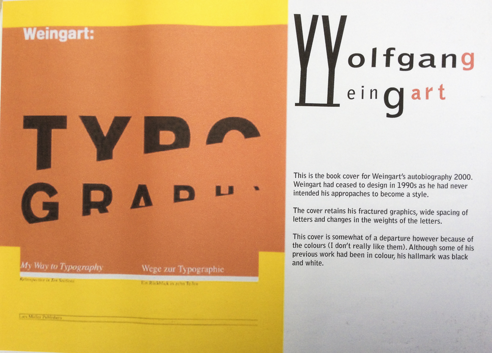
Wolfgang Weingart (born 1941 in the Salem Valley in southern Germany) is an internationally known graphic designer and typographer.
His work is categorized as Swiss typography and he is credited as “the father” of New Wave or Swiss Punk typography.
“I took ‘Swiss Typography’ as my starting point, but then I blew it apart, never forcing any style upon my students. I never intended to create a ‘style’. It just happened that the students picked up—and misinterpreted—a so-called ‘Weingart style’ and spread it around.” Weingart
Weingart spent his childhood in Germany, moving briefly to Lisbon in 1954 with his family. In April 1958 he returned to Germany and studied typesetting, linocut and woodblock printing at the Merz Academy in Stuttgart . He then completed a three-year typesetting apprenticeship in hot metal hand composition at Ruwe Printing. From 1963 he has been based at Basel School of Design as a student and from 1968 – 2005 as teacher of typography. He was a member of the Alliance Graphique Internationale (AGI) from 1978 to 1999. From1970 to 1988 he was on the editorial board of Typographische Monatsblätter magazine.
Publications
Weingart, Wolfgang. Weingart: Typography—My Way to Typography, a retrospective volume in ten sections, Baden: Lars Müller Publishers, 2000 (ISBN 978-3907044865)
Knapp, Susan, Eppelheimer, Michael, Hofmann Dorothea et al. Weingart: The Man and the Machine, statements by 77 of his students at the Basel School of Design (1968–2004), Basel: Karo Publishing, 2014 (ISBN 3-9521009-7-8)
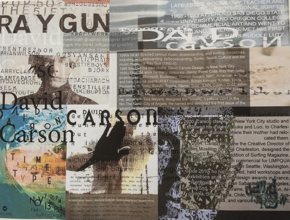
David Carson (born September 8, 1954) is an American graphic designer, art director and surfer. He is best known for his innovative magazine design, and use of experimental typography.
He worked as a sociology teacher and professional surfer in the late 1970s. From 1982 to 1987, Carson worked as a teacher in Torrey Pines High School in San Diego, California. In 1983, Carson started to experiment with graphic design and found himself immersed in the artistic and bohemian culture of Southern California. He art directed various music, skateboarding, and surfing magazines through the 1980/90s, including twSkateboarding, twSnowboarding, Surfer, Beach Culture and the music magazine Ray Gun. By the late 1980s he had developed his signature style, using “dirty” type and non-mainstream photographic techniques.
As art director of Ray Gun (1992-5) he employed much of the typographic and layout style for which he is known. In particular, his widely imitated aesthetic defined the so-called “grunge typography” era. In one issue he used Dingbat as the font for what he considered a rather dull interview with Bryan Ferry. In a feature story, NEWSWEEK magazine said he “changed the public face of graphic design”.
He takes photography and type and manipulates and twists them together and on some level confusing the message but in reality he was drawing the eyes of the viewer deeper within the composition itself. His layouts feature distortions or mixes of ‘vernacular’ typefaces and fractured imagery, rendering them almost illegible. Indeed, his maxim of the ‘end of print’ questioned the role of type in the emergent age of digital design, following on from California New Wave and coinciding with experiments at the Cranbrook Academy of Art.
In the later 1990s he added corporate clients to his list of clients, including Microsoft, Armani, Nike, Levi’s, British Airways, Quiksilver, Sony, Pepsi, Citibank, Yale University, Toyota and many others. When Graphic Design USA Magazine (NYC) listed the “most influential graphic designers of the era” David was listed as one of the all time 5 most influential designers, with Milton Glaser, Paul Rand, Saul Bass and Massimo Vignelli.
He named and designed the first issue of the adventure lifestyle magazine Blue, in 1997. David designed the first issue and the first three covers, after which his assistant Christa Smith art directed and designed the magazine until its demise. Carson’s cover design for the first issue was selected as one of the “top 40 magazine covers of all time” by the American Society of Magazine Editors.
In 2000, Carson closed his New York City studio and followed his children, Luke and Luci, to Charleston, South Carolina where their mother had relocated them. In 2004, Carson became the Creative Director of Gibbes Museum of Art in Charleston, designed the special “Exploration” edition of Surfing Magazine, and directed a television commercial for UMPQUA Bank in Seattle, Washington.
Carson claims that his work is “subjective, personal and very self indulgent”.
Bibliography
Carson, David (1995). The End of Print: The Graphic Design of David Carson. Chronicle Books. ISBN 0-8118-1199-9.
Carson, David (1997). David Carson: 2nd Sight: Grafik Design After the End of Print. Universe Publishing. ISBN 0-7893-0128-8.
Meggs, Phillip B.; David Carson (1999). Fotografiks: An Equilibrium Between Photography and Design Through Graphic Expression That Evolves from Content. Laurence King. ISBN 1-85669-171-3.
Stecyk, Craig; David Carson (2002). Surf Culture: The Art History of Surfing. Laguna Art Museum in association with Gingko Press. ISBN 1-58423-113-0.
Mcluhan, Marshall; David Carson, Eric McLuhan, Terrance Gordon (2003). The Book of Probes. Gingko Press. ISBN 1-58423-056-8.
Carson, David (2004). Trek: David Carson, Recent Werk. Gingko Press. ISBN 1-58423-046-0.
Mayne, Thom; David Carson (2005). Ortlos: Architecture of the Networks. Hatje Cantz Publishers. ISBN 3-7757-1652-1.
It was first used by US sci fi enthusiast Louis Russell Chauvenet in 1940 and by 1949 was in common use.
‘Fanzine’ was abbreviated to ‘zine’ in 1970s. The rise of fanzines was part of the punk subcultural response to mainstream society – in this case, mainstream print.
Distribution: Zines were hand-made publications produced in small quantities on an irregular basis.They were usually small enough to easily fit in the hand although sometimes they were oversized broadsheets. They were distributed by hand and word of mouth or via independent music or book stores or through zine fairs and symposia.
Readership were super-niche interest groups and cultural underground.
Production: Created by a single producer as both author and designer. Unencumbered by censorship or corporate strategy. Producers were often readers and/or fans sharing same interests.
Subject matter As ‘Genuine voices outside of all mass manipulation’ they explored a wide variety of themes political, humorous, poetic, underground music not necessarily represented in more conventional print. They were also a forum for personal experimentation‘perzines’ as unique auto/biographical snapshots.’practice of self-making though zine-making is particularly momentary,’Sometimes a testing ground to ideas which then move to the mainstream. Eg Giant Robot and Bust Magazine.
Style Lively Do it yourself style uninhibited by design conventions. Often chaotically lively layout.
Cheap and designed to be ephemeral They were often printed using photocopiers, stencil and other ‘hands-on’ processes. Sometimes they were more 3-dimensional and incorporated recycled objects or materials.
Materials different coloured papers, crayons, felt-tip markers, Ribbons, stickers. Collages photos hand-drawn illustrations. often made with very basic tools: scissors, glue.
Typography handwritten or typewritten or using rub-down lettering.
Feminist zines use provocative language, sexual imagery, a mix of styles aiming to shock. Guerilla Girls, a feminist group fighting sexism in arts practice produced many fanzines. Formed in New York in 1985, the group maintain their anonymity by wearing gorilla masks and using the names of dead female artists as pseudonyms, e.g. Frida Kahlo and Hannah HÖch. They put pressure on organisations such as the Metropolitan Museum of Art in New York by uncovering statistics that reveal the extent of patriarchy in the art world past and present. The original group disbanded in 2001 but several Guerrilla Girl spin-offs still exist. Recent campaigns include ‘Unchain female directors’ targeted at the male-dominated world of the Hollywood film studio.
St John’s college photo
In the 1990s faux fanzines started to be produced by multinational companies. Dirt by Warner Brothers, Full Voice by Body Shop etc.
The earliest forms of books were scrolls produced by Egyptian scribes over 4,000 years ago.
Images and vertical text were hand-drawn onto palm leaves, then later onto papyrus scrolls.
Papyrus was made from the pith of the papyrus plant and was rather like thick paper. It was used throughout the ancient world until the development of parchment.
Parchment was a superior material to papyrus. Made from dried, treated animal skin, parchment could be written on on both sides and was more pliable than papyrus, which meant that it could be folded.
Folding a large parchment sheet in half created two folios – a word we still use today to number pages. Folding the sheet in half again created a quarto(4to) and folding that in half again made eight pages – an octavo (8vo).The development of parchment created a break with the scroll form. Folded pages were now piled together and bound along one edge to create a codex, a manuscript text bound in book form.
Paper, invented in China, spread through the Islamic world to reach medieval Europe in the 13th century, where the first paper mills were built. See ‘Paper’ full post.
Skilled hand-lettering was laborious and time-consuming and a world apart from the printing methods of today.
Illuminated manuscripts
The term manuscript comes from the Latin for hand ‘manus’ and writing ‘scriptum’. Illuminated manuscripts, often containing religious, historical or instructive texts, were coloured with rich and delicate pigments, often with the addition of gold leaf. These were objects of rare beauty. Bound manuscripts were produced in Britain from around 600 to 1600.
The advent of movable type
Movable type brought about a massive revolution in the way books were designed, produced and perceived. Sandcast type was used in Korean book design from around 1230 and woodblocks were used to print paper money and cards in China from the seventh century. Johann Gutenberg produced the first western book printed using movable type in 1454. This was the Gutenberg Bible or ‘42-line Bible’. This led the way for a revolution in the way books were designed and printed. Having set the metal type, the printer could then produce multiple copies. The printing process made books much more widely available to a larger audience. By 1500, printing presses in Western Europe had produced more than twenty million books.
Arts and Crafts movement
Private English presses such as Doves Press and the Ashendene Press typified the publishing industry in the early part of the twentieth century. The influential designer, craftsman, artist and writer William Morris (1834–96) founded the Kelmscott Press in 1891; this was dedicated to publishing limited edition, illuminated style books. The designer Eric Gill (1882–1940), a fellow member of the Arts and Crafts movement, designed books for both English and German publishers. Gill also produced The Canterbury Tales (1931) for Golden Cockerel Press, which was one of the last English presses still going strong after 1925.
While English and German publishers were known for the quality and craftsmanship of their typography and overall book design, French publishers such as Ambroise Vollard (1866–1939) focused on the illustrative elements of book design. ‘Livres de luxe’ were expensive editions of books illustrated by contemporary artists such as Bonnard, Chagall, Degas, Dufy and Picasso.
20th Century
Artistic movements had a real and direct impact on book design in the twentieth century, with the Fauvists, Futurists, Dadaists, Constructivists and Bauhaus feeding into a febrile pot of manifestos, ideas and approaches to typography and book design. Allen Lane founded Penguin Books in England in 1935, with the aim of producing affordable books for the masses. The books were characterised by strong typographic and design principles. In the early 1950s designers Jan Tschichold and Ruari McLean created modernist iconographic cover designs for Penguin books. Advancing print technologies, letterpress, offset lithography and the development of graphic design, gave rise to a plethora of colour printed material, making book design one of the earliest and best examples of mass communication.
The 1980s and 1990s saw the burgeoning of desktop publishing (DTP). Book design was no longer bound by the constraints of metal typesetting. Apple Macintosh computer systems enabled book designers to integrate text and images into multiple pages digitally, on-screen. This move away from traditional design and printing processes created massive upheaval in the publishing industry, and many long-established forms of working were usurped by the new digital technology.
In new wave of graphic and book designers emerged who embraced the new technology and, like the Futurists and Dadaists before them, questioned and experimented with some of the conventional approaches to typography and book design. Designers such as Neville Brody (Fuse magazine) and David Carson (The End of Print) captured the experimental mood of the time.
The revolution in printing processes continues apace today, but the book in its traditional form remains a pervasive presence alongside its digital counterparts – the e-book is a good example. The internet has revolutionised the way book designers work, making distance book design work a commonplace reality. In addition, a huge and often overwhelming range of fonts, images and resources is immediately available online. The word ‘font’ has entered everyday vocabulary – even for schoolchildren – and choosing the best font for the job is now something that many of us do almost without thinking. DTP means that everyone can potentially access what they need to design a book. From a purist perspective, the inherent danger with this creative freedom is that poor design choices result from uninformed ‘quick-fix’ solutions. The positive aspect is that the designer has never before had so many options to choose from, in terms of typography, design and production values.
Anything is Possible One Stroke at a Time
At first glance, a Zentangle creation can seem intricate and complicated. But, when you learn how it is done, you realize how simple it is . . . sort of like learning the secret behind a magic trick. Then, when you create a piece of Zentangle art, you realize how fun and engrossing the process itself is.
We love presenting to a class or seminar full of people who are convinced they can’t draw the Zentangle art we show them. Then, within 15 minutes, they have easily accomplished what they thought was impossible. This is one of our favorite Zentangle moments, because then we ask, “What else do you know that you can’t do?” You can transfer that insight and experience of success and accomplishment to any life experience. Something may look complicated, but you now know that you can do it, one simple stroke at a time.
Deliberate Stroke
In our Zentangle way, you draw each stroke consciously and deliberately. We are always making “strokes” (thoughts, words, deeds) in our life. By practicing the Zentangle Method’s suggestion to make each stroke deliberate, you understand how those apparently small and insignificant “strokes” of our moment to moment lives contribute to an overall life pattern. This is another reason that we say that life is an artform and everyone is an artist. Indeed, everyone draws.
Deliberate Focus
As you make a deliberate pen stroke on your Zentangle tile without concerning yourself of what it will look like when you are done, that very act of putting your pen to paper focuses your attention in a special way. As your eye follows your pen strokes your attention shifts to a state that allows fresh thoughts, new perspectives, and creative insights to flow unhindered by anxiety or effort.
No Eraser
There is no eraser in life and there is no eraser in a Zentangle Kit. However, in creating Zentangle art (and in living life), you will discover that apparent mistakes can be foundations for new patterns and take you in unexpected and exciting new directions.
Unknown Outcomes
Unlike much art, or most activities, you start out intentionally not knowing what your Zentangle creation will look like. The Zentangle Method allows you to discover new possibilities that you might not have anticipated when you began. We can most always tell when we’ve preplanned a specific outcome when using our Zentangle Method. It almost always looks forced and stiff.
No Predetermined Solution
With no predetermined correct answer, the Zentangle method offers both a freedom and a challenge. Unlike crossword, jigsaw, or Sudoku puzzles, there is no one predetermined solution. You cannot fail to create Zentangle art. At first this freedom might be a bit unnerving, as many of us have been trained to look for the one perfect solution. Soon however, this becomes a freeing and uplifting experience as you realize you can create never-ending, ever-changing “solutions” in your Zentangle creations.
Elegance of Limits
In seeming contradiction the limits established by a Zentangle string frees up your creativity. As you use the Zentangle Method, you’ll understand.
Abstract
You always succeed when you create Zentangle art because you always create a pattern. A Zentangle creation is meant to be nonrepresentative with no up or down. Since it is not a picture of something, you have no worries about whether you can draw a hand, or a duck. You always succeed in creating a pattern in a Zentangle way.
Portable
A Zentangle tile is 3 1/2 inches (89 mm) square. A Zentangle tile is designed to be completed in one sitting. Keep some Zentangle tiles in your pocket or purse. You can finish one in as little as 15 minutes. You get an immediate sense of accomplishment by completing your work of art. Of course, you can spend as much time as you like on a tile. Time melts as you focus on and enjoy your penstrokes.
Inspirational
The Zentangle Method’s non-verbal language of patterns and proportions can open doors to insights which seemed locked before. Creating in a Zentangle way opens those doors, not because they were locked, but because those doors swing on non-verbal hinges. When you create in a Zentangle way you can enter a state of relaxed focus in which intuitive insights flow freely. Get inspirations, ideas and answers unhindered by expectations or worries.
High Quality
Out of respect for yourself and your craft, we always encourage people to use the best tools and materials possible. We designed our Zentangle Kit with that in mind.
Ceremony
Like a Japanese Tea Ceremony, when you create Zentangle art you also create a personal environment. You can use our Zentangle approach as a tool to deliberately focus your thoughts.
Gratitude
Gratitude is our foundation. It also informs our product design and our teaching method. Whether its appreciating the texture of these wonderful paper tiles, becoming aware of the patterned beauty around us or thankful for the opportunity to put pen to paper, we always return to gratitude.